Design concept
2026
SaaS
A redesign of an established direct-mail platform for roofers, real-estate agents, and home-service businesses. I turned an engineer-built dashboard into a guided product that helps non-technical owners understand the platform and reach their first campaign with confidence.
Role
Product Designer
Duration
2 weeks
Status
Design concept

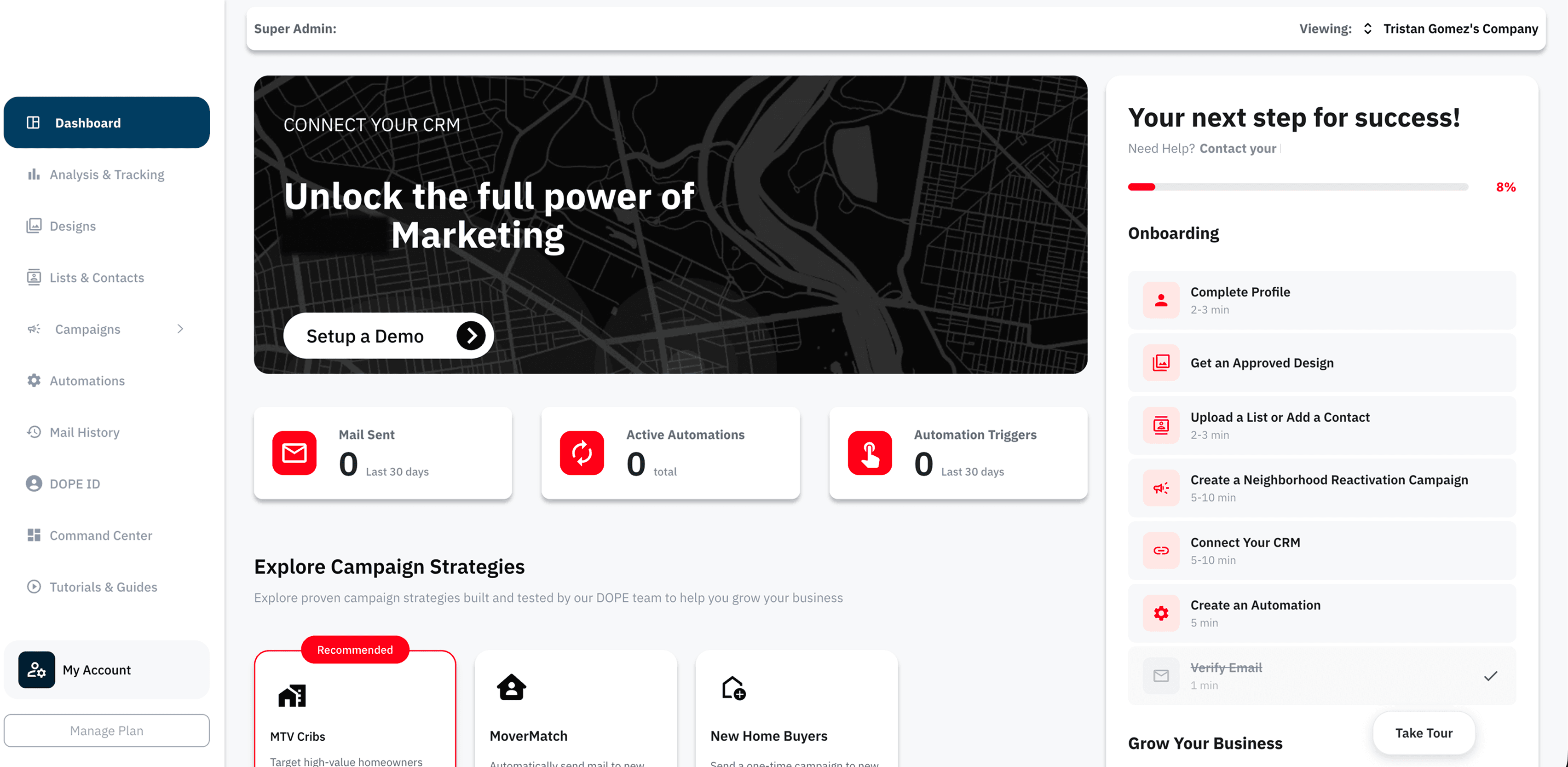
A capable product that did not yet feel approachable
The platform already handled targeted postcards, automated mail, audience lists, tracking, and printing. The challenge was helping a busy local-business owner understand what to do with all of it.
The existing dashboard was functional, but features, empty metrics, onboarding tasks, campaign strategies, and sales prompts all competed for attention. It reflected the system behind the product more than the mental model of the people using it.
The actual problem
New users needed guidance, not a catalogue. Active users needed campaign health and performance, not the same setup-heavy hierarchy. The product also needed to support customers who skipped onboarding without leaving them stranded.
The redesign goal
Create an activation-focused experience that changes with the account: establish trust at entry, collect only the context needed for personalization, lead users toward a first campaign, and prioritize live work once they become active.
The dashboard showed everything except the next step
What looked like visual clutter was a deeper problem of hierarchy, sequencing, and state.
01
Hierarchy
Competing priorities above the fold
A CRM banner, progress panel, empty metrics, strategies, and navigation all asked for attention at once.
03
Comprehension
Internal names came before customer outcomes
Campaign strategies assumed that a first-time user already understood the platform vocabulary.
04
Relevance
New and active accounts shared the same structure
The dashboard did not change enough as a user progressed from setup to running campaigns.
The UX challenges underneath
01
Guide without blocking
Create a strong happy path without forcing every user through onboarding before they can explore.
02
Simplify without hiding consequence
Keep campaign creation easy while making audience size, cost, timing, and delivery explicit.
03
Serve different account states
Make the same dashboard useful before setup, during activation, and after campaigns become active.
04
Translate product language
Explain unfamiliar campaign strategies through outcomes a local-business owner already understands.

Built for owners who need marketing to feel manageable
The core audience was not a team of campaign specialists. It was local-business operators trying to grow while also running the business itself.
Primary
Owner / operator
Time-poor and often non-technical. Needs to know what to do next, what it will cost, and what result to expect.
Secondary
Growth lead
Runs repeat campaigns and compares performance. Needs campaign status, responses, spend, and clear opportunities to act.
Entry segment
Print customer
May receive platform access through the print service. Needs a clear bridge from ordering materials to running a targeted campaign.
The inherited journey
After account creation, users landed in a dashboard containing setup tasks, empty analytics, campaign strategies, CRM prompts, and product navigation. The intended route existed, but the interface did not establish which parts were required, optional, or useful later.

The redesigned happy path
The redesign turns the implicit journey into a progressive path. Each step produces context for the next, while users who skip onboarding can still explore and resume setup later.

The key journey decision was to make onboarding useful to the campaign and not an administrative task before it.
Solution / 01
Personalization without a long questionnaire
The strongest intervention was not a visual refresh. It was turning onboarding into an activation system that collects only the inputs needed to make the first campaign easier and more relevant.
01
Business context
Industry and company details make later recommendations relevant.

02
Outcome-led goals
Users answer in the language of growth, not product features.

03
Concrete targeting
Coverage, estimated households, and cost make the choice understandable.

Solution / 02
The dashboard adapts to account maturity
Skipped onboarding and active use are not treated as edge cases. Each state gets a different information hierarchy and a different job to do.


Solution / 03
One complete path from intention to a campaign in market
I designed one full campaign-creation experience rather than isolated setup screens. The flow carries context from onboarding into strategy, targeting, creative selection, review, and launch. The interaction model keeps one decision in focus at a time, makes reach and cost visible before commitment, supports templates or an uploaded design, and ends with a reviewable summary and a concrete delivery expectation.


Solution / 04
Responsive by priority, not just by size
The mobile layouts preserve the same decision hierarchy while changing how information is revealed: focused setup forms, a usable navigation drawer, and stacked campaign cards that remain scannable in the field.

A cohesive product story from first visit to first send
The final design connects entry, activation, dashboard states, campaign creation, and mobile use into one system.
4
Account states addressed
1
End-to-end campaign flow
Web + mobile
Responsive delivery
How the model changed
Busy → directed
Every state establishes one clear action before secondary discovery.
Generic → contextual
Business type, goals, and service area shape what the product recommends.
Static → adaptive
Setup guidance gives way to performance and active work as the account matures.
Fragmented → continuous
One campaign journey connects strategy, targeting, creative, review, and launch.
What I would validate next
This was a design exercise grounded in a real product, so the outcome is described through delivered scope rather than invented business metrics. The next phase would measure onboarding completion, time to first campaign, drop-off by setup stage, repeat campaign creation, and discovery of the integrated print service.
02
See also