Product Design
2024-25
Crypto/Fintech
A full web app redesign for Zenrock, a decentralised key management platform for builders of cross-chain protocols and wallets, covering UX, interface, and design system.
I worked with the team to understand the product direction and translate it into a clear, usable interface.
I designed the full website experience in Figma, including user flows, high-fidelity screens, and the component-based design system. After finalizing the design, I built the live website in Framer, ensuring the layout, visuals, and interactions matched the intended experience.
My focus was on turning product and branding requirements into a cohesive design and delivering a production-ready implementation.
Zenrock enables builders of cross-chain protocols and wallets to manage keys in a decentralised way, removing the fragmented, chain-by-chain approach that every multi-chain product runs into.
The Product
A decentralised key management platform targeting protocol engineers and wallet builders. The core value proposition is omnichain security, one system for managing keys across chains, rather than a different solution per chain.
The Engagement
The team needed a redesign of the full web app experience and not a cosmetic refresh, but a structured rethink of the interface, navigation, and visual language. I worked with them to understand the product direction, then led the redesign from UX through high-fidelity screens to a component-based design system.
Deliverables
User flows, information architecture, high-fidelity Figma screens, and a scalable design system with reusable components and documented guidelines.
In a high-trust, infrastructure category, the interface is part of the product's credibility. What we found was working against it.
Decentralised key management for omnichain builders
Things working against the product
Before designing anything, we evaluated what existed. The problems weren't isolated; they compounded. A fragmented interface, no system, and unclear journeys made a technically strong product harder to trust.
01
Inconsistent branding fragmented the experience
Visual inconsistencies across pages created a disjointed product feel. The interface didn't read as a single, coherent thing and it read as several things built at different times, which undermined the product's credibility with a technical audience that notices that.
03
The interface was behind on usability standards
Visual inconsistency extended to the component level, with typography, spacing, and interaction patterns applied unevenly. The product had matured; the interface hadn't kept pace, and the gap was visible.
04
No design system meant no path to consistency
Without shared components or documented patterns, every new surface required making the same decisions again. There was no foundation to build on, which meant consistency was impossible to maintain as the product grew.
Understand the product, then fix the experience
The process moved through four phases each one building directly on the last, from diagnosis to a production-ready design system.
01
Discovery
Worked with the team to understand business goals, product direction, and where the current experience was failing. Audit findings shaped every subsequent decision.
02
UX & IA
Defined user flows and information architecture before touching the visual layer. Getting navigation and structure right first meant the visual design had something solid to build on.
03
High-fidelity design
Translated the UX structure into high-fidelity Figma screens, applying a unified visual language across every surface, built from the design system up.
04
Design system
Built the component library and documented guidelines in parallel with the screens so the system emerged from real design decisions rather than being retrofitted afterwards.
What changed, and why
Each of the four audit findings had a direct design response. The redesign addressed them together, not as isolated fixes, but as a single coherent system.
Brand
Brand - One visual language, applied everywhere.
01
Color
Inconsistent usage across pages replaced with a defined token-based palette applied consistently site-wide.
02
Typography
Mixed typefaces and weights were replaced with a single type scale, documenting sizes, weights, and spacing rules applied across every surface.
03
Spacing
Ad-hoc spacing decisions replaced with an 8px grid and defined spacing tokens applied consistently across every component and layout.
04
Identity
An interface that read as early-stage now presents with the coherence and credibility the product's technical depth deserves.
UX
Clearer paths through the product.
The information architecture was restructured around how users actually move through the product and not how the product happened to be organised. Navigation was simplified and the hierarchy of content was made explicit.
01
Navigation
IA restructured around primary user tasks, with key actions surfaced at the right point, not buried in secondary menus.
02
Hierarchy
Every page now has a defined reading sequence. Content is prioritised, not flattened, so users know where to look first.
03
User journey
Logical flow from value proposition to technical depth, matched to how builders actually evaluate infrastructure products.
04
Task completion
Reduced friction across core journeys, users reach what they need faster, with fewer dead ends and less backtracking.
Interface
Modern, consistent UI across every screen
The visual overhaul went beyond aesthetics it was about applying consistent interaction patterns, spacing logic, and component behaviour across every surface. The interface now matches the maturity of the product it represents.
01
Typography
A defined type scale is applied to headlines, body, UI labels, and captions, all following the same system. No more ad-hoc sizing decisions per page.
02
Spacing
An 8px grid with defined spacing tokens. Consistent spatial logic means components align without manual adjustment and layouts hold at any viewport.
03
Interaction
Hover states, focus styles, and transitions are documented and applied consistently so the interface feels considered rather than assembled from parts.
Design system
A foundation the team can build on
The design system was built in parallel with the screens emerging from real decisions rather than being retrofitted. It gives the team a shared foundation so future work doesn't require re-solving what's already been solved.
01
Color tokens
Semantic naming for brand, surface, text, and interactive states applied via tokens so the palette can evolve without requiring a component-by-component update.
02
Component library
Reusable Figma components covering navigation, cards, CTAs, forms, and page sections. Each component has defined variants and documented usage guidelines.
03
Documentation
Usage guidelines alongside each component so decisions made during the redesign don't get lost in translation when the next designer or handoff happens.
What the redesign established
Impact
Brand & Interface
A product that looks as strong as it is.
Unified visual language across every screen, consistent type, colour, spacing, and interaction patterns. The product now presents with the credibility its technical depth deserves.
UX & Navigation
Journeys that match how builders actually evaluate products
Restructured information architecture and navigation flows. Users reach what they need faster, and the path through the product reflects the way a technical audience evaluates infrastructure tools from value proposition to technical depth.
Design system
Consistency that scales without supervision
A component library with reusable components and documented guidelines. Future surfaces can be built on the system without re-making decisions that have already been made.
Learnings
L.01
In infrastructure, credibility is a design problem
Visual inconsistency reads as an engineering risk to a technical audience. Design decisions carry trust signals, and in a high-stakes category, those signals matter before anyone reads a word of copy.
L.02
Structure the UX before touching the visual layer
Getting the IA and navigation right first meant the visual design had something solid to work from. Starting with visuals when the structure is broken produces beautiful problems, not solutions.
L.03
Build the system from real decisions, not before them
Designing the system in parallel with the screens meant every component solved an actual problem. Retrofitting a system onto finished designs produces documentation, not a foundation.

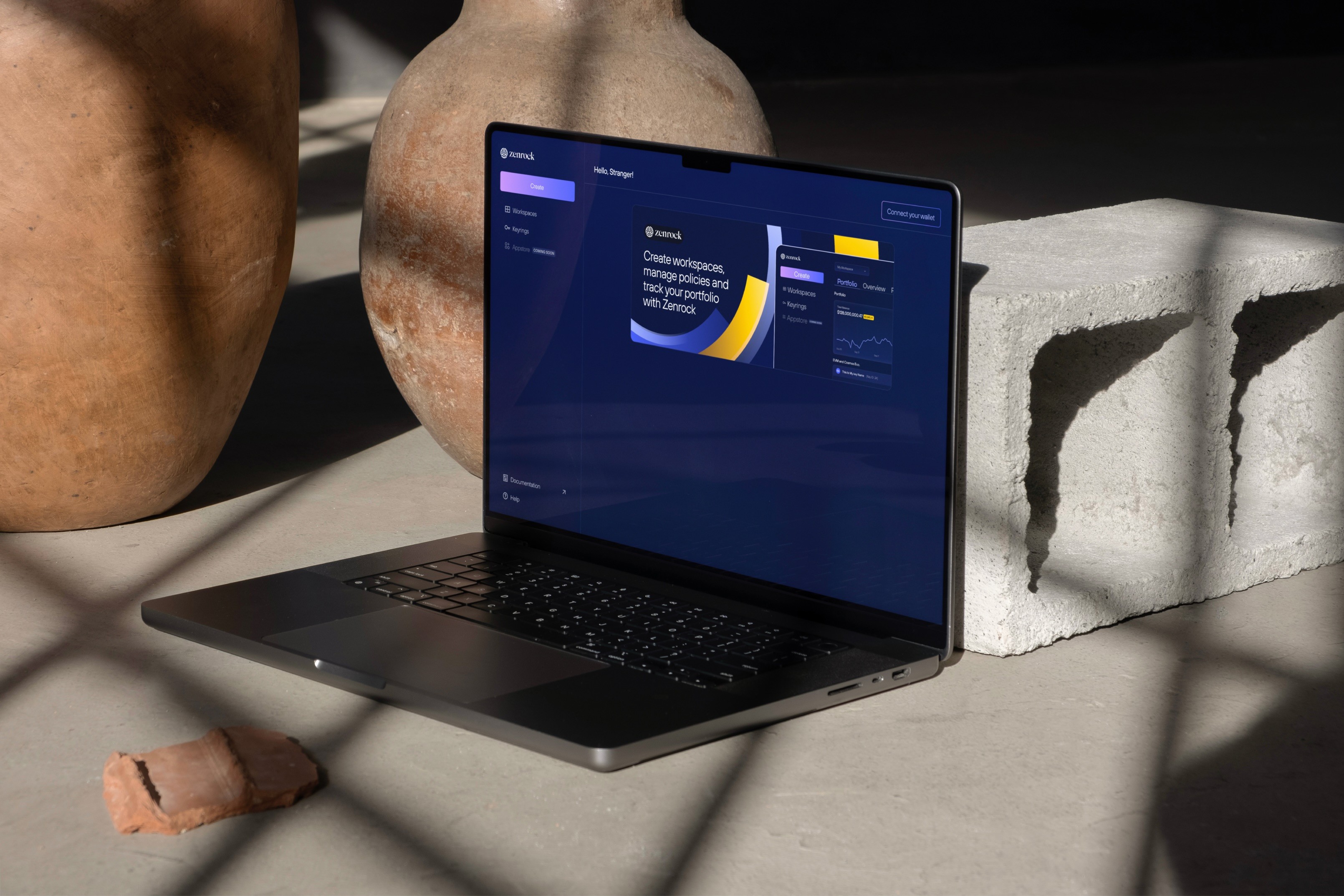
Portal (Landing)
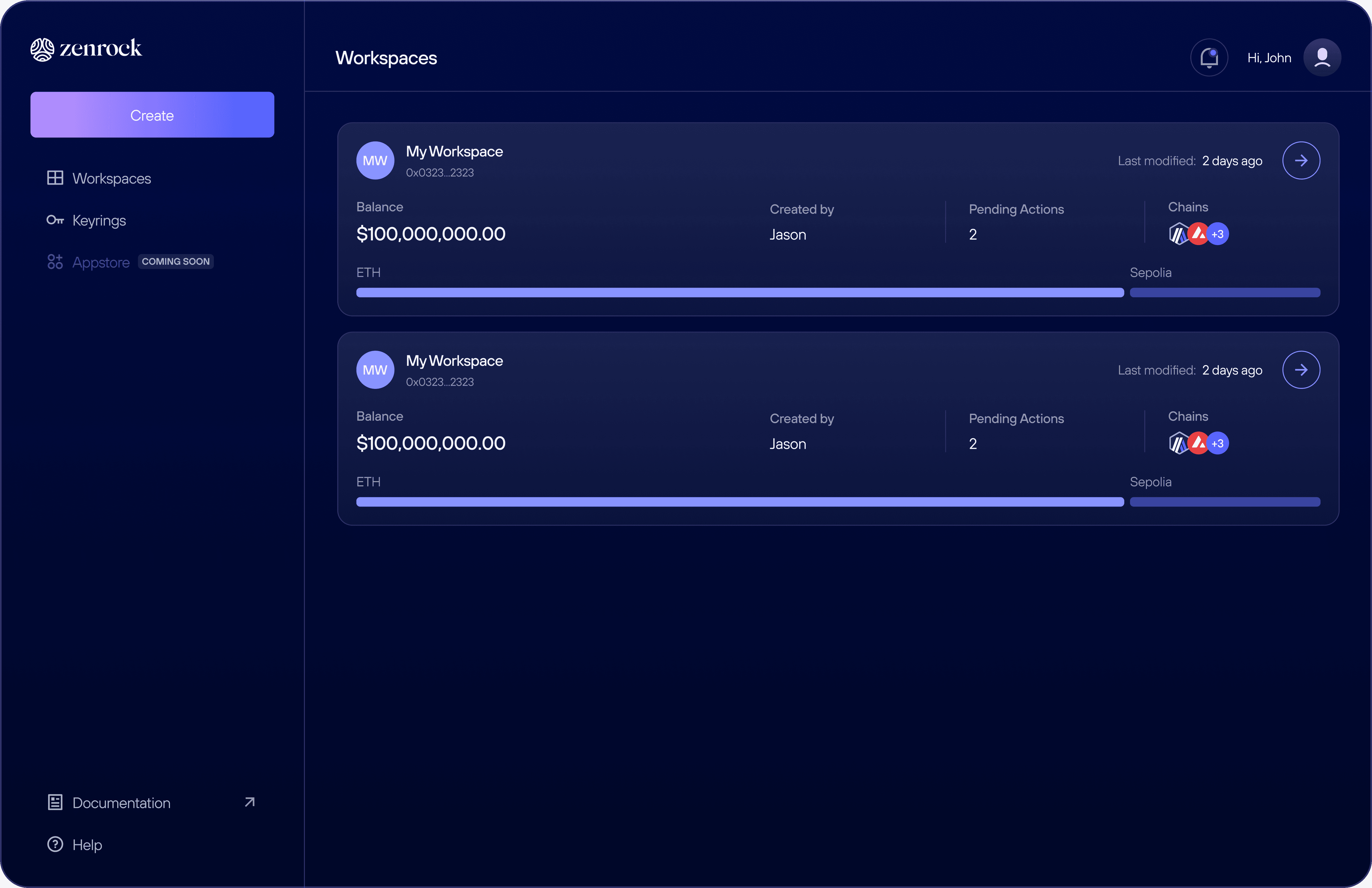
Workspaces
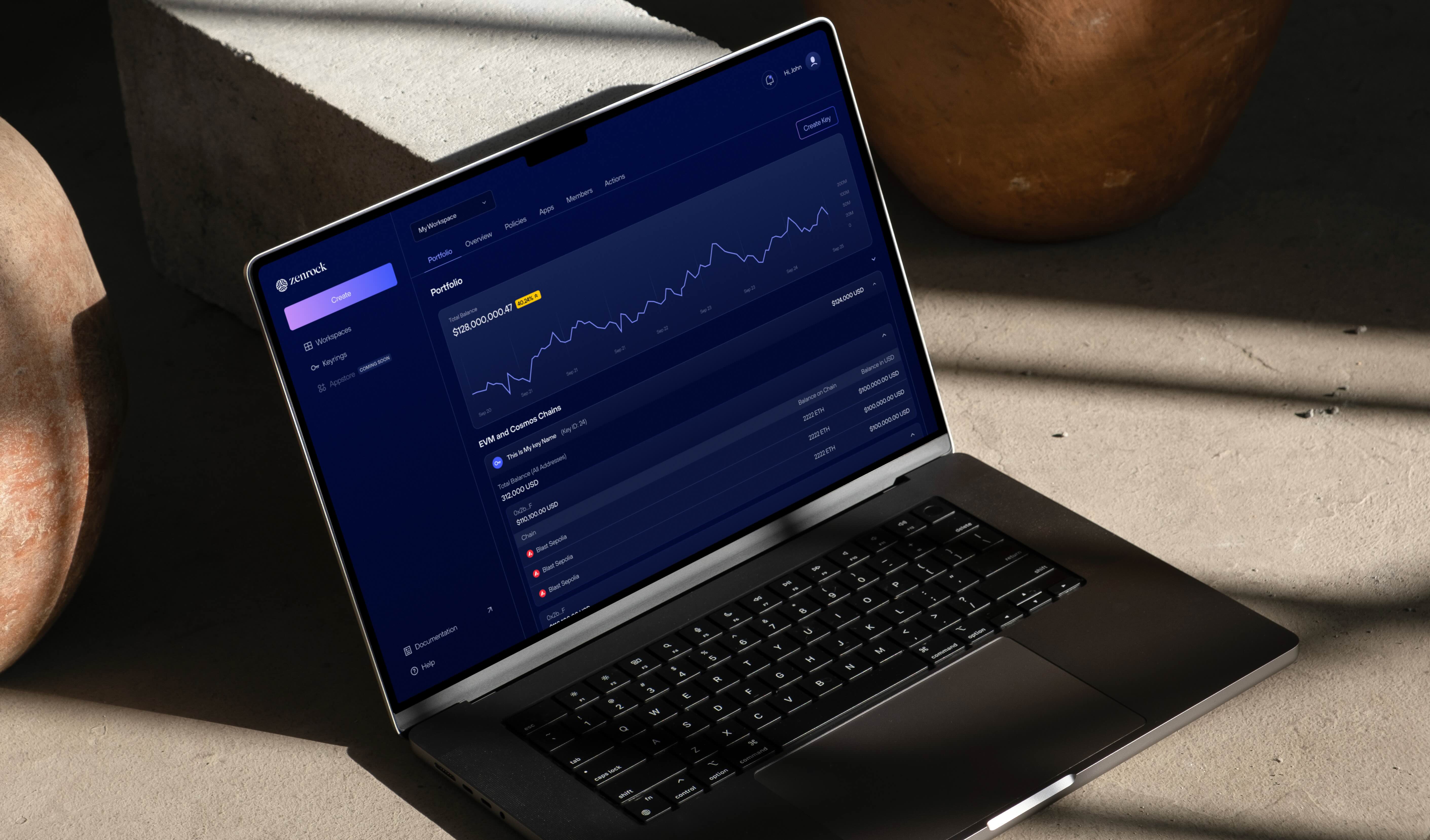
Portfolio
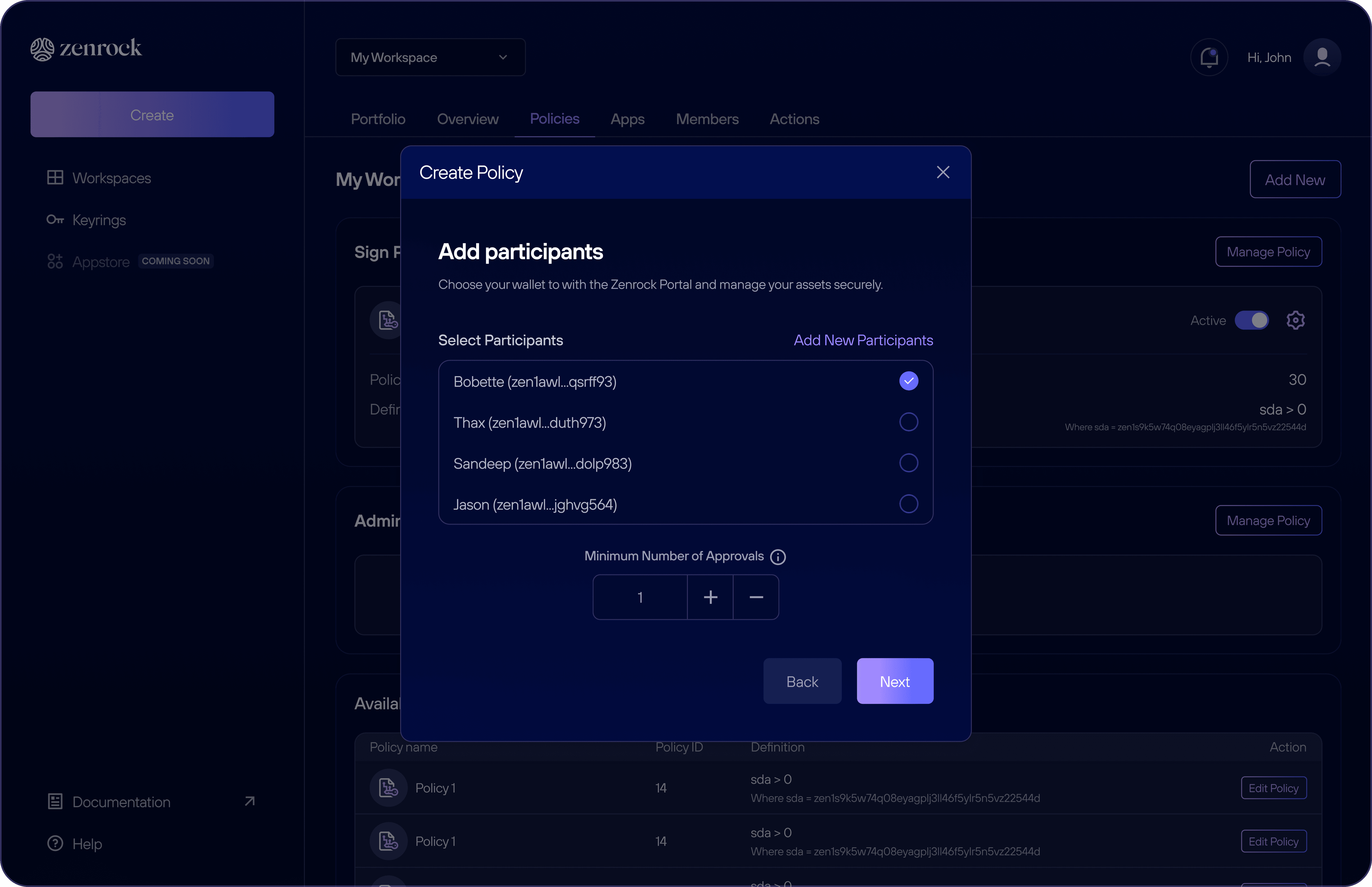
Create new policy
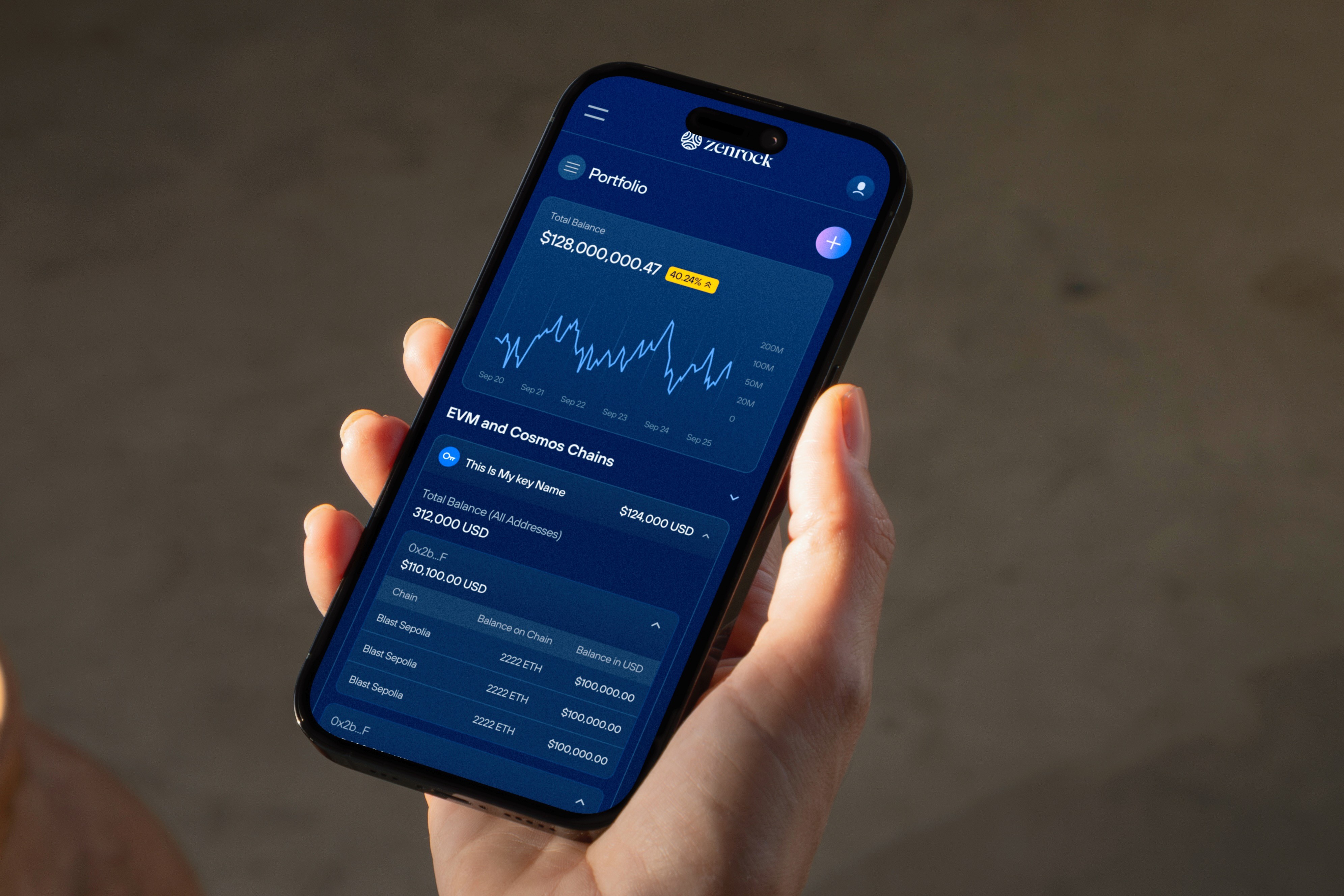
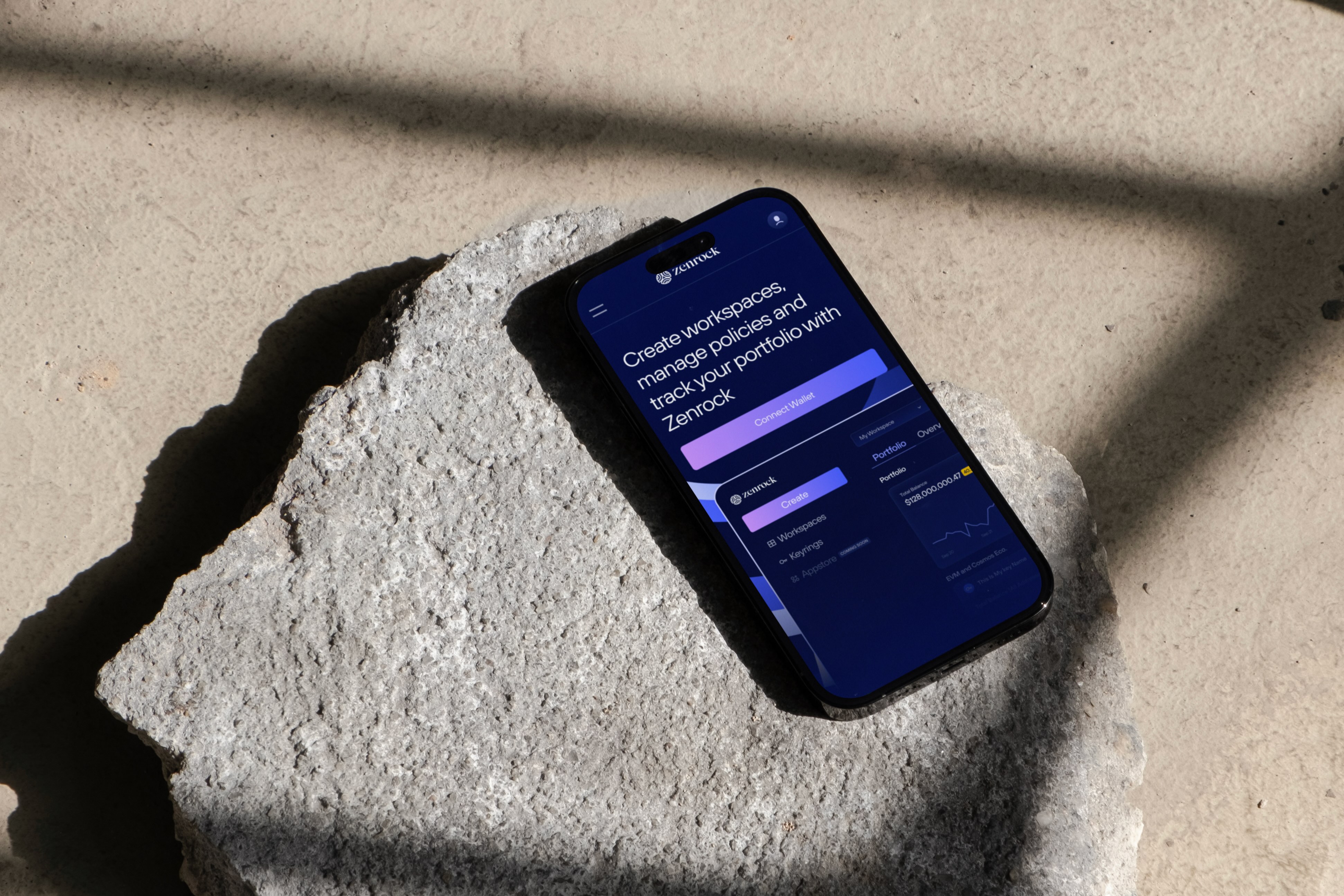
Portfolio (Mobile)

Add a member
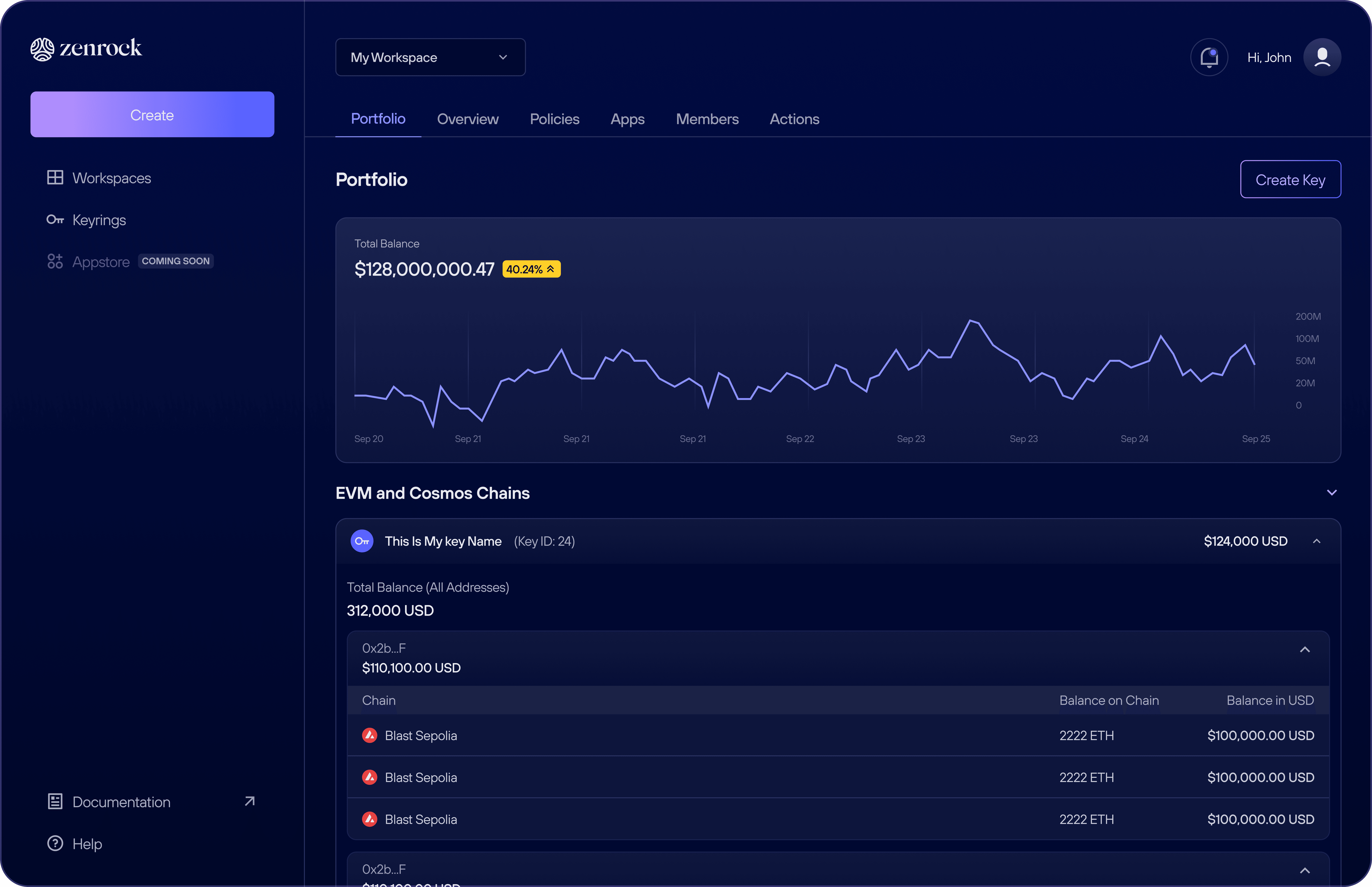
Portfolio
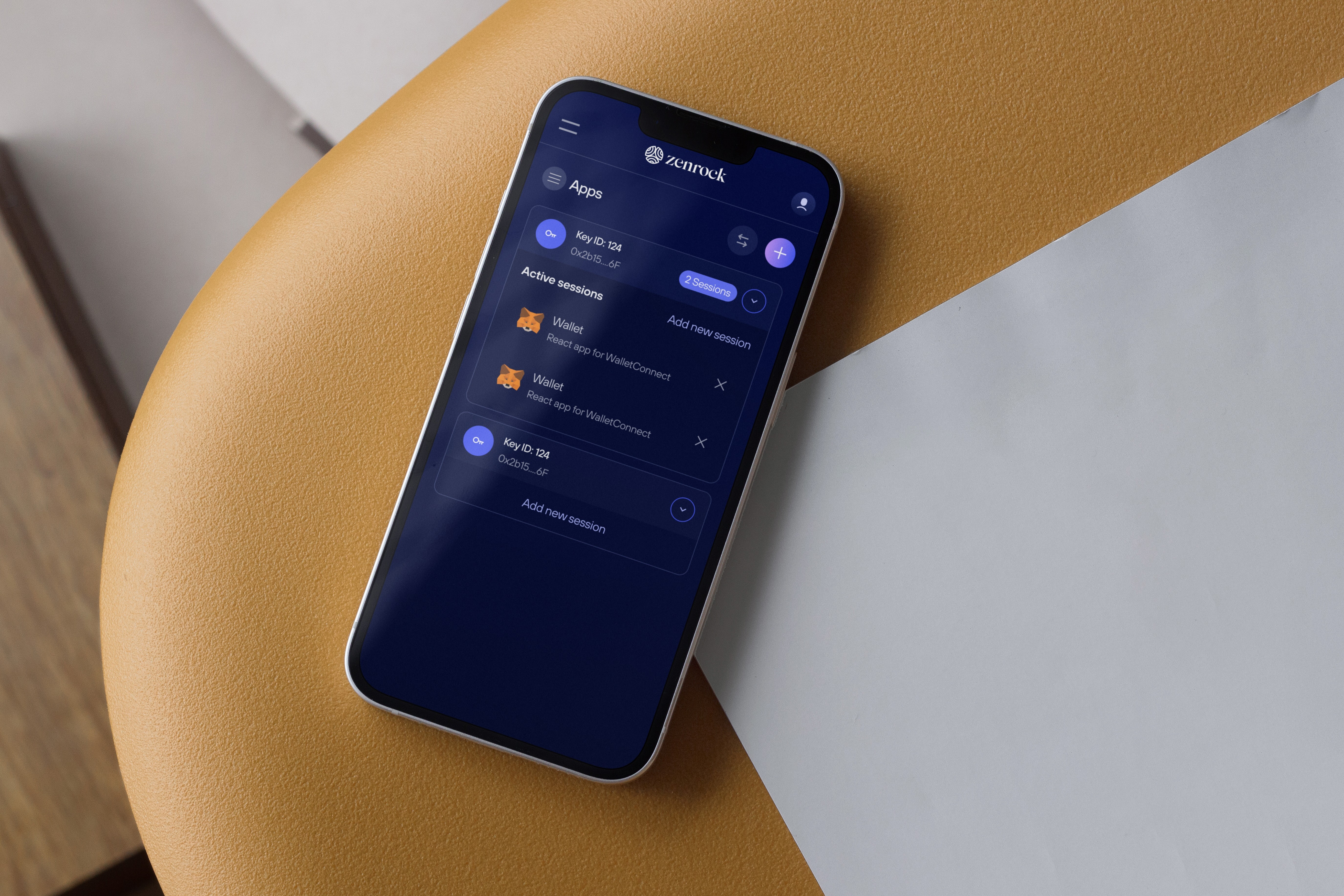
Connected apps (Mobile)
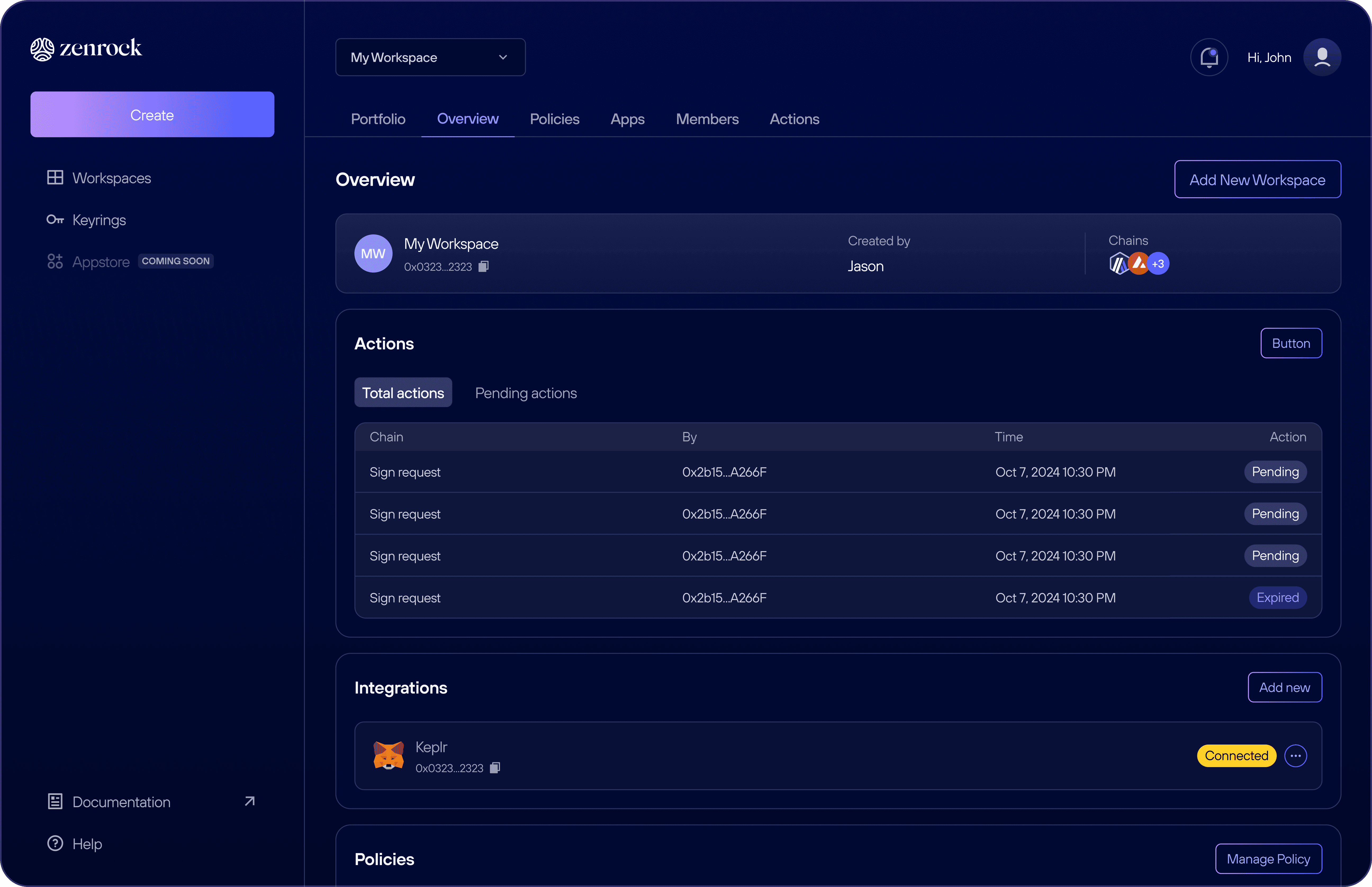
Overview
Landing
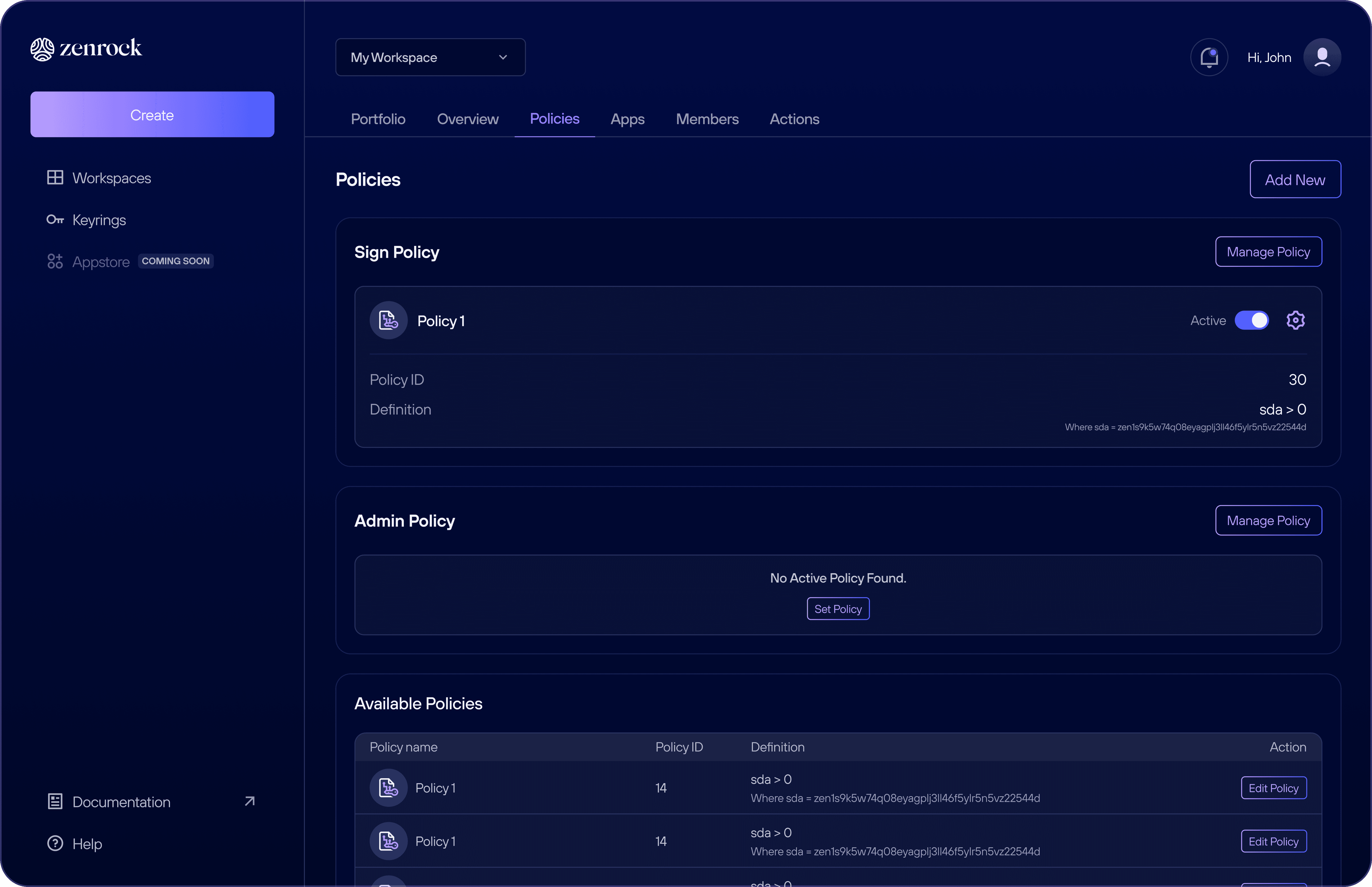
Policies
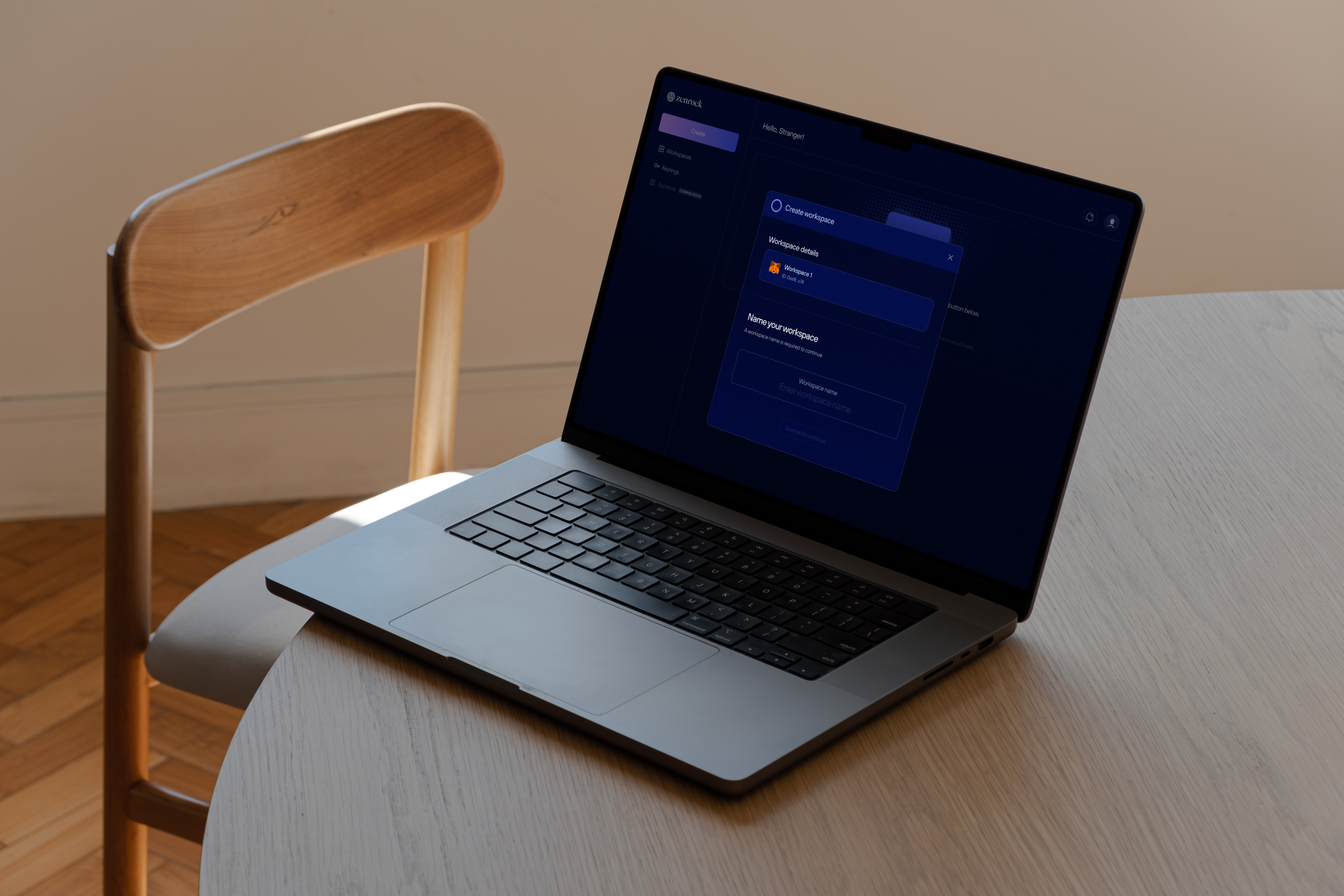
Create workspace
Workspace wallet
Keyrings
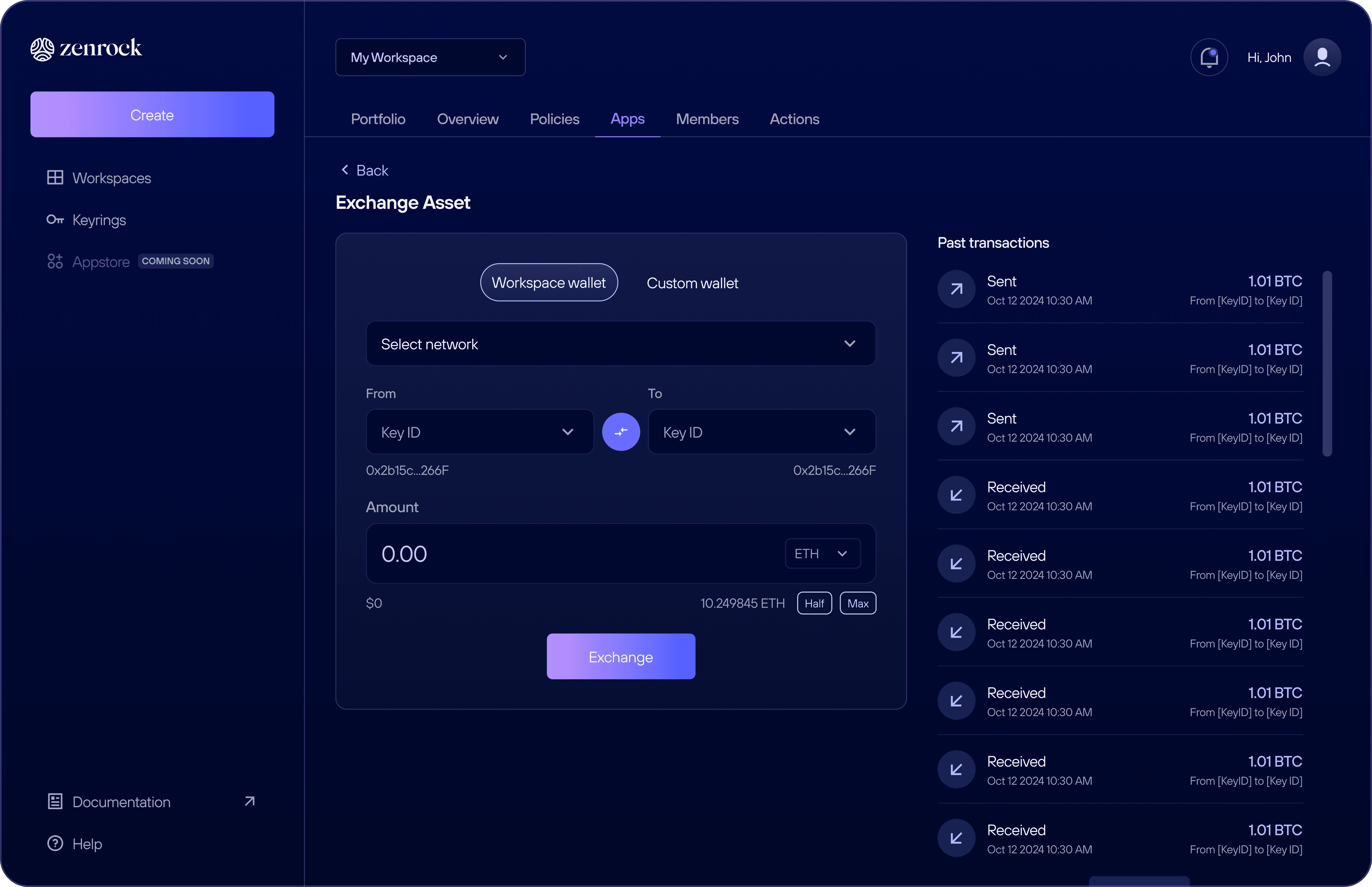
Connected apps
Connect your wallet
02
See also