Product Design
2022-23
Crypto/Fintech
The Delphi Chart builder is an intuitive no-code solution that allows users to explore and build widgets using datasets.
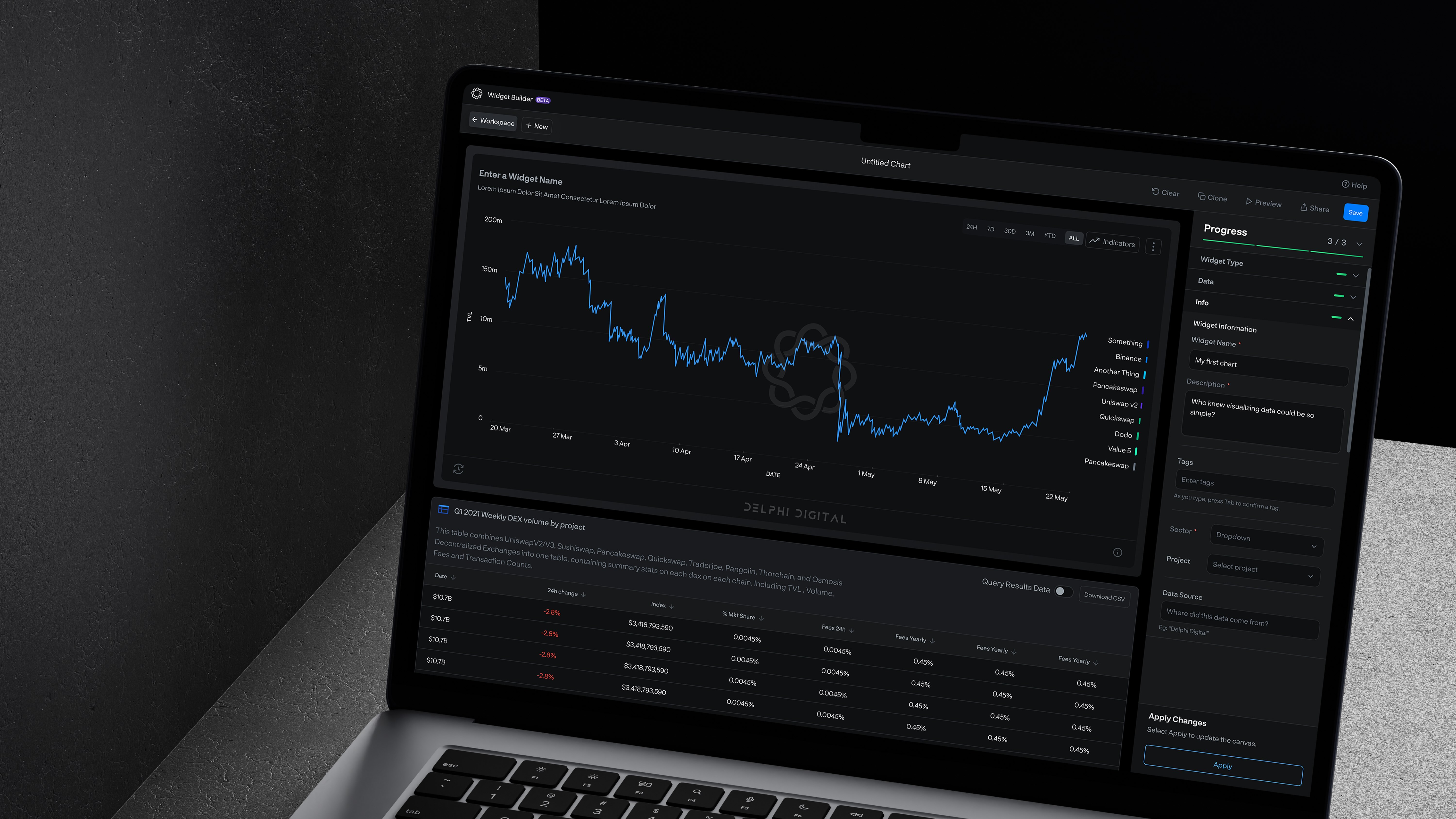
I was primarily responsible for designing the first version of the product, from early concepts and UX structure to high fidelity UI.
I created initial mockups, mapped user journeys, and designed the core builder experience for charts, widgets, and dashboards. Working within strict brand constraints, I established a cohesive interface using the existing visual language while building a functional and scalable UI.
After launch, I collaborated with the team to improve usability. This included restructuring the widget creation flow into clearer progressive stages so users could build charts and dashboards more easily and quickly. Later iterations and feature expansions were continued by the broader design and development team.
This product is a no code data builder that allows users to create charts, widgets, and full dashboards using existing or custom datasets without writing code. Users can combine datasets, apply filters, build KPI widgets, organize projects, and share or publish dashboards with permission controls.
The goal was to design an intuitive system that simplifies complex data visualization workflows while supporting customization, sharing, and scalable project organization.
Making complex data visualization workflows feel simple enough to build without code.
My Role
Four distinct workstreams across the project lifecycle, from defining the first product structure to improving it after launch.
01
Product structure
Defined how charts, widgets, dashboards, and projects would work together as one connected system from the first version.
02
User journeys
Mapped journeys across dataset selection, chart creation, widget building, dashboard organization, and publishing.
03
Design within constraints
Used layout, hierarchy, spacing, and interaction patterns to achieve clarity inside an existing visual language.
04
Post-launch iteration
Restructured the widget creation flow into progressive stages to reduce setup friction after the initial launch.
Making complex crypto data workflows easy to build without code.
Complex data workflows were powerful, but too difficult to structure without a clear builder experience.
Users needed to move from datasets to charts, widgets, and dashboards, but the workflow involved too many decisions at once. They had to choose data sources, combine datasets, select visualization types, apply filters, configure values, customize outputs, and manage sharing or publishing settings. The challenge was to reduce this complexity without removing the flexibility advanced users needed.
01
Too many decisions in one flow
Users had to choose data sources, combine datasets, select visualization types, apply filters, configure values, customize labels, and manage outputs. Without a clear structure, the builder could feel overwhelming.
03
Existing brand constraints limited flexibility
The interface had to stay consistent with the existing visual language, which meant the design couldn’t rely on a completely new system to solve usability problems.
04
Sharing and publishing needed clearer paths
Dashboards were not only meant to be created, but also previewed, shared, published, and controlled through permissions. These paths needed to feel connected to the core workflow.
UX Challenges
01
Structuring a complex builder journey
Users needed to move from datasets to charts, widgets, and dashboards, but the workflow involved many decisions across data selection, visualization, filtering, customization, and publishing.
02
Reducing cognitive load
Crypto data can be dense and technical, so the experience needed to simplify configuration without making the product feel limited or too basic.
03
Designing within existing constraints
The interface had to work within an established brand and product system, which limited how much the layout, visual language, and interaction patterns could change.
04
Balancing power and simplicity
The product needed to support advanced use cases like custom datasets, combined data sources, KPI widgets, and permission controls, while still feeling usable for non-technical users.
05
Creating a scalable workspace model
Charts, widgets, dashboards, projects, sharing, and publishing all needed to feel connected, so the product could grow without becoming fragmented.
06
Making customization feel manageable
Users needed control over labels, values, filters, and presentation settings, but those controls had to be organized clearly to avoid overwhelming the creation flow.
Structure before polish
The major UX decisions revolved around simplifying the builder flow and giving users a clearer path from data source to final dashboard without limiting what they could do.
How the builder was shaped
Four core decisions drove the experience, each one reducing friction without reducing capability.
01
Progressive creation flow
Broke the builder into smaller stages so users make decisions in sequence and not all at once. Reduced cognitive load without removing any options.
02
Clear data-to-output structure
Organized the flow around a simple sequence: select data → choose visualization → apply filters → configure values → customize → publish. That sequence became the spine of the whole experience.
03
Clarity over visual complexity
Prioritized function over decoration. Users were already navigating complex data decisions and adding visual complexity on top would have made the cognitive load worse, not better.
04
Scalable workspace model
Treated charts, widgets, dashboards, projects, sharing, and permissions as parts of one connected workspace from the start so the product could scale beyond v1 without a structural redesign.
A guided builder that reduces decisions
A clearer path from raw datasets to visual outputs. Create, organize, and share from one structured workspace.
Flow
The creation sequence
Six steps. Each one narrows the decision space before the next one opens. The sequence is the UX.
05
Customize the output
Adjust styling and layout within the brand system constraints. Customization is last after the data is right.
06
Preview, share, or publish
Preview before committing. Share a link directly, or publish with permission controls. Distribution is part of the builder, not an afterthought.
01
Select the data source
Connect an existing dataset or bring your own. The entry point is always the data not the visualization type.
02
Choose the visualization type
Bar, line, pie, KPI widget, pick the output format before configuring it. Type informs configuration, not the other way around.
03
Apply filters
Narrow the dataset to the relevant range, segment, or condition. Filters are a dedicated step, not buried in settings.
04
Configure values and labels
Set axes, metrics, units, and display options with the chart visible so configuration and output are always in view together.
Workspace
One system for everything
Charts, widgets, dashboards, projects, sharing, and permissions were designed as parts of one connected workspace not a set of loosely linked features.
01
Charts
Individual visualizations built from a single dataset. The atomic unit of the builder everything else is composed from charts.
02
Widgets
Configured chart outputs including KPI cards and summary views. Widgets are charts with a defined display format and ready to be placed in a dashboard.
03
Dashboards
Collections of widgets organized into a shareable view. Dashboards are the final deliverable the thing that gets previewed, shared, or published.
04
Projects
Organizational containers for charts, widgets, and dashboards. Projects allow teams to keep work scoped without fragmenting the workspace.
05
Permissions
Sharing and publishing controls built into the dashboard workflow. View, comment, or edit access configured at the dashboard level.
What the first version established
Impact
Foundation
A scalable no-code data visualization product.
The first version established the structural foundation for charts, widgets, dashboards, projects, sharing, and permissions to scale together as one system not a set of loosely connected features.
Builder Experience
Complex configuration made navigable
A process involving multiple data sources, visualization types, filters, and configuration steps was reorganized into a progressive flow that reduced cognitive load without reducing capability.
Post-Launch
Widget flow restructured into progressive stages
After launch, the widget creation flow was revised to break setup into sequential steps making the product easier to understand on first use and easier to trust on repeat use.
Learnings
L.01
Complex tools need structure before visual polish
The temptation was to make the builder feel powerful. The right move was to make it feel clear. Structure came first and polish followed where it earned its place.
L.02
Progressive flows work when users face many configuration decisions
Exposing everything at once creates anxiety, not capability. Sequencing decisions even the same decisions transformed how the builder felt to use.
L.03
Clarity within constraints comes from layout, not a new system
Working inside an existing brand forced better structural decisions. Hierarchy, spacing, and interaction patterns did the work that a new design system would have done elsewhere.
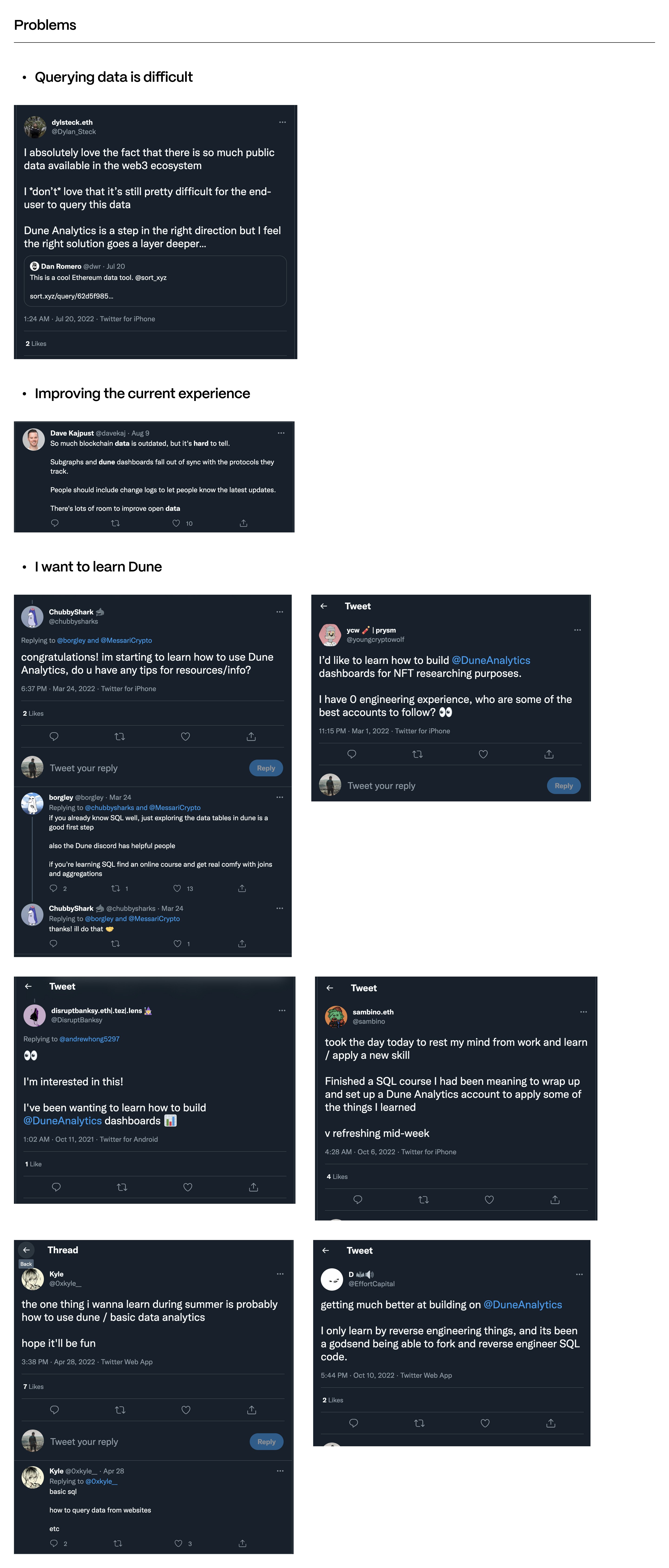
Problems, Research, and Needs
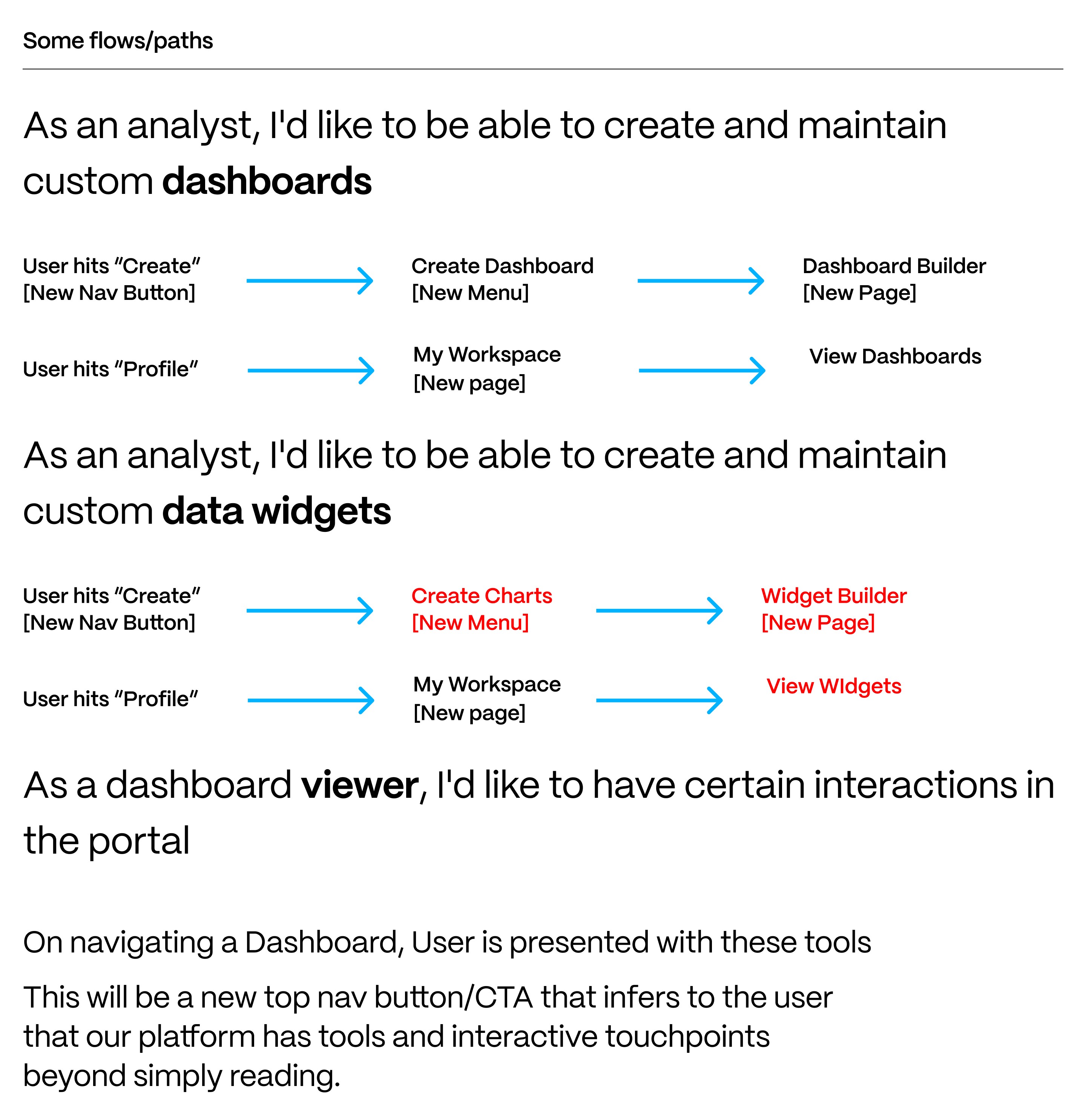
Userflows and direction
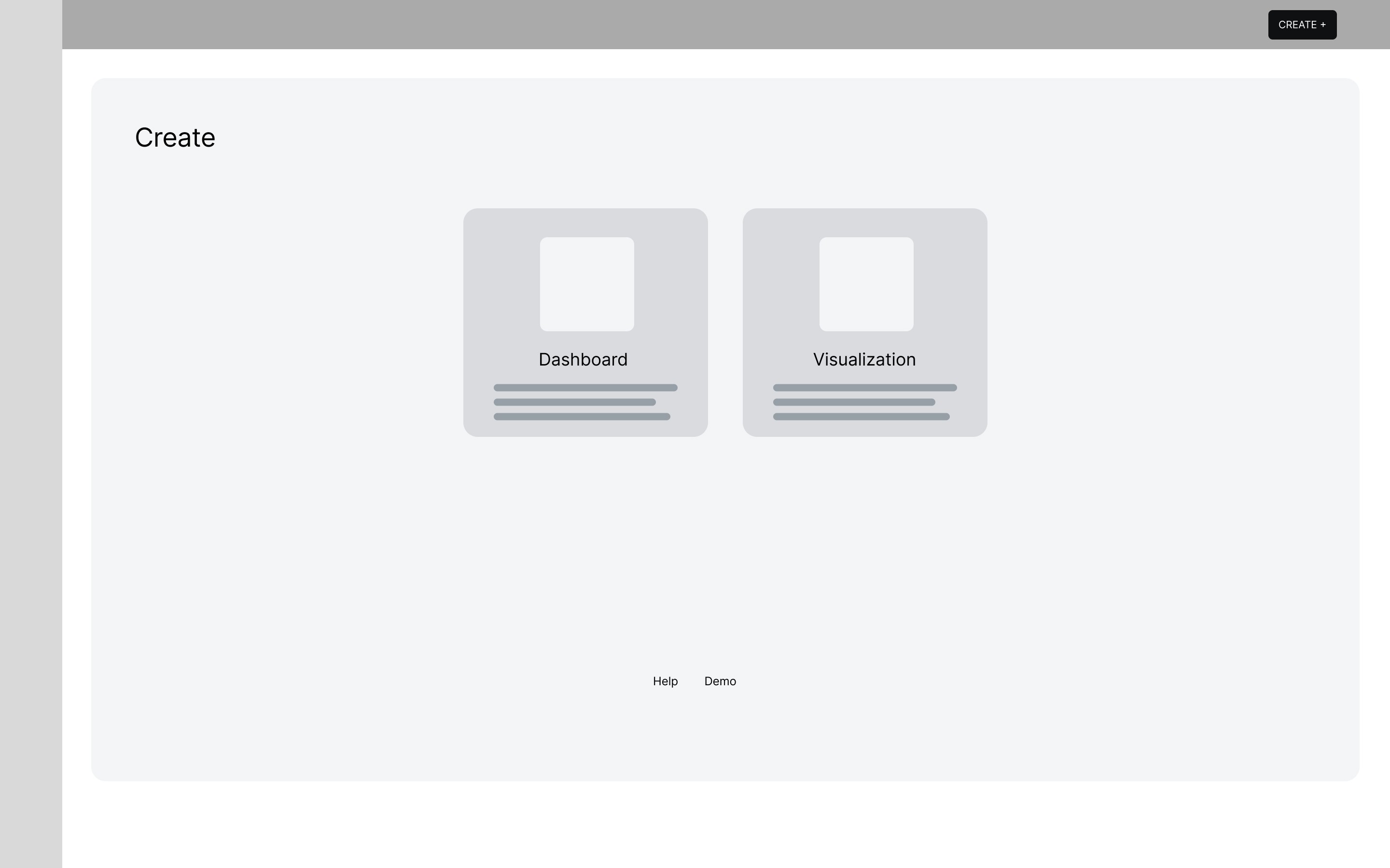
Initial Datahub Lander
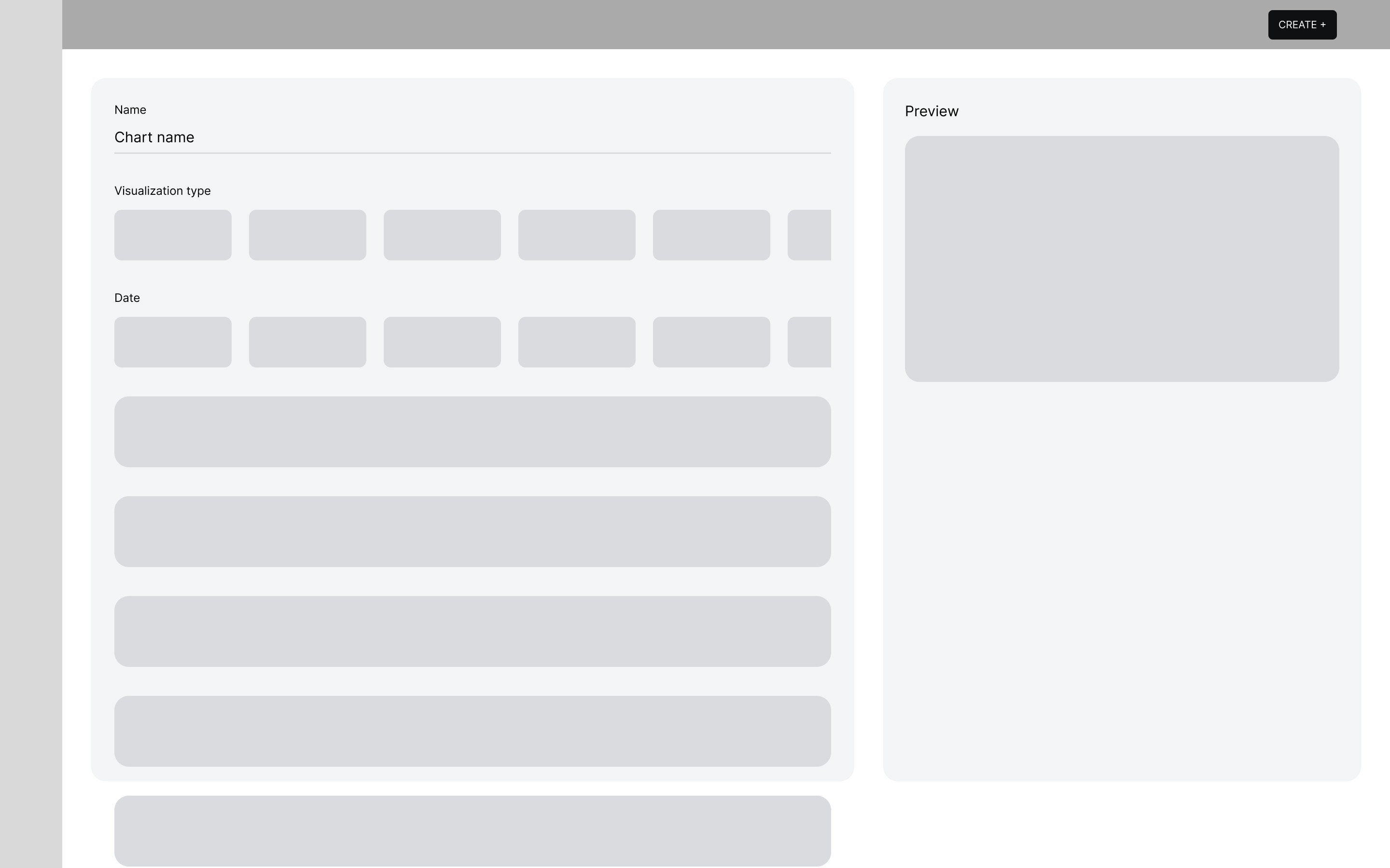
Chart Builder 0.1- Browse Dataset Screen
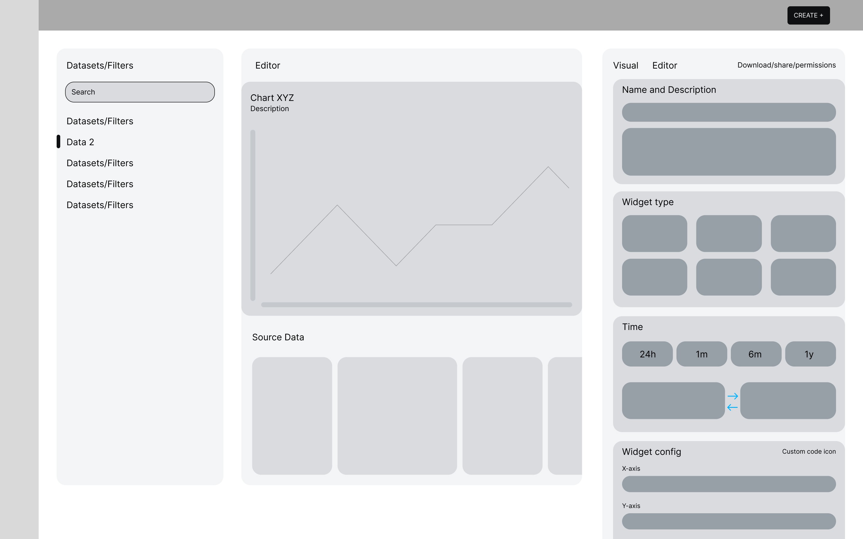
Chart Builder 0.1
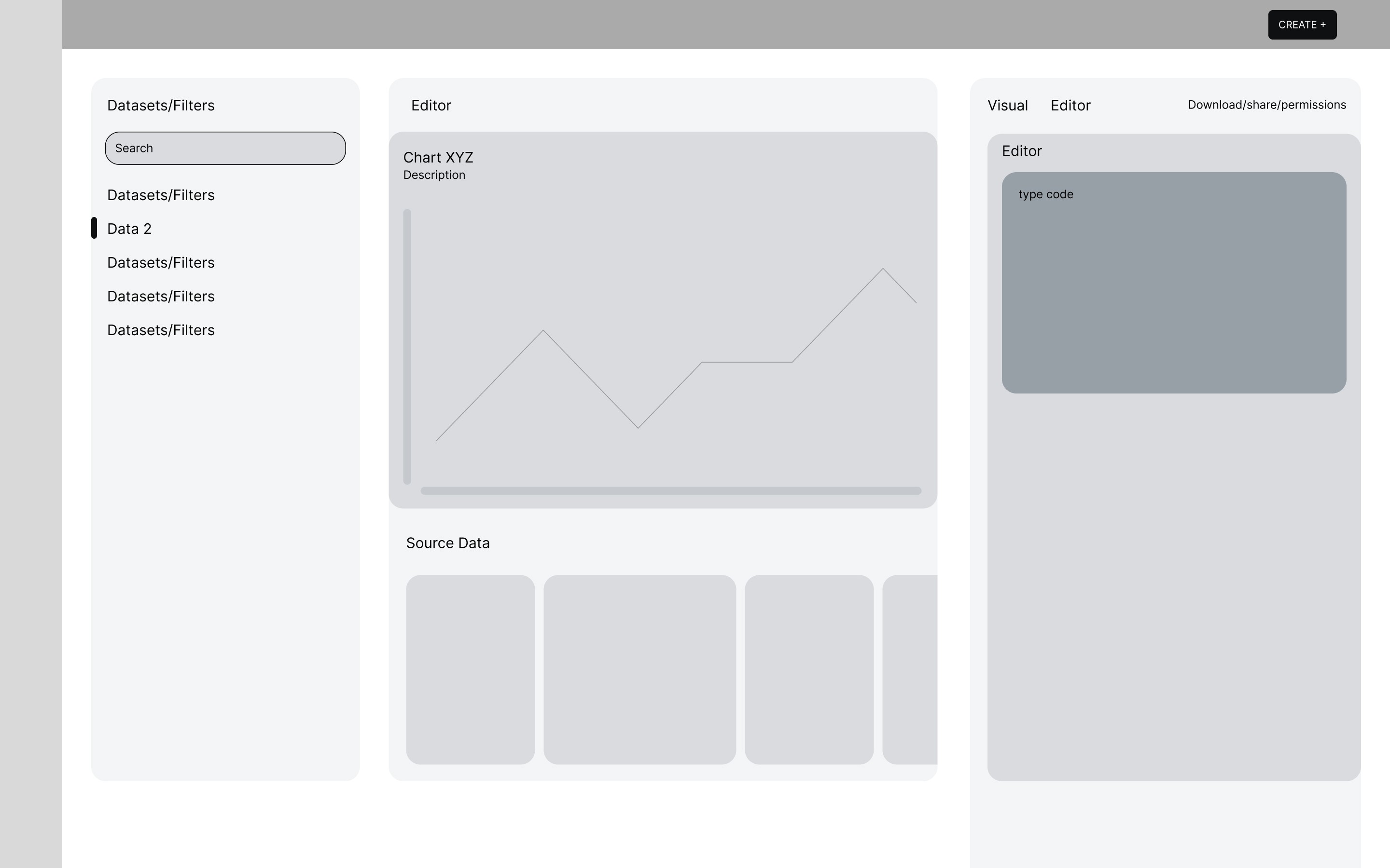
Chart Builder 0.1- WIdget info Screen
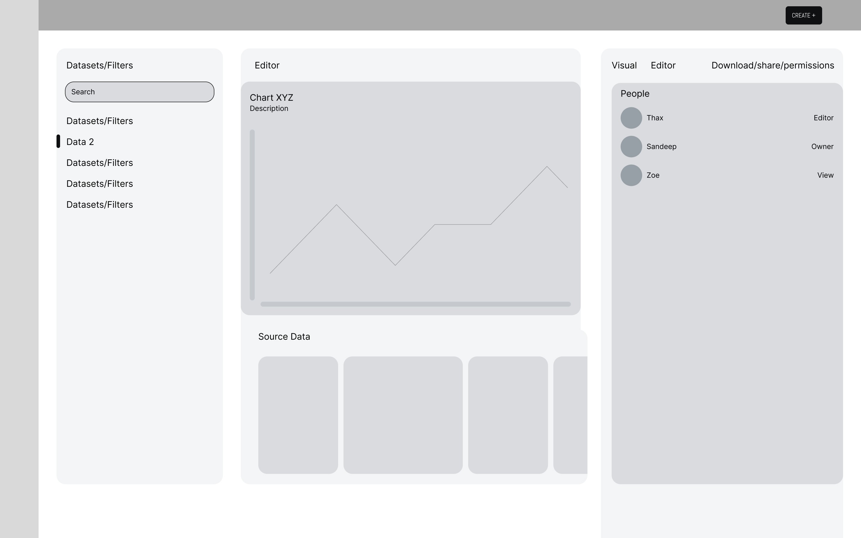
Chart Builder 0.1- WIdget Share Screen
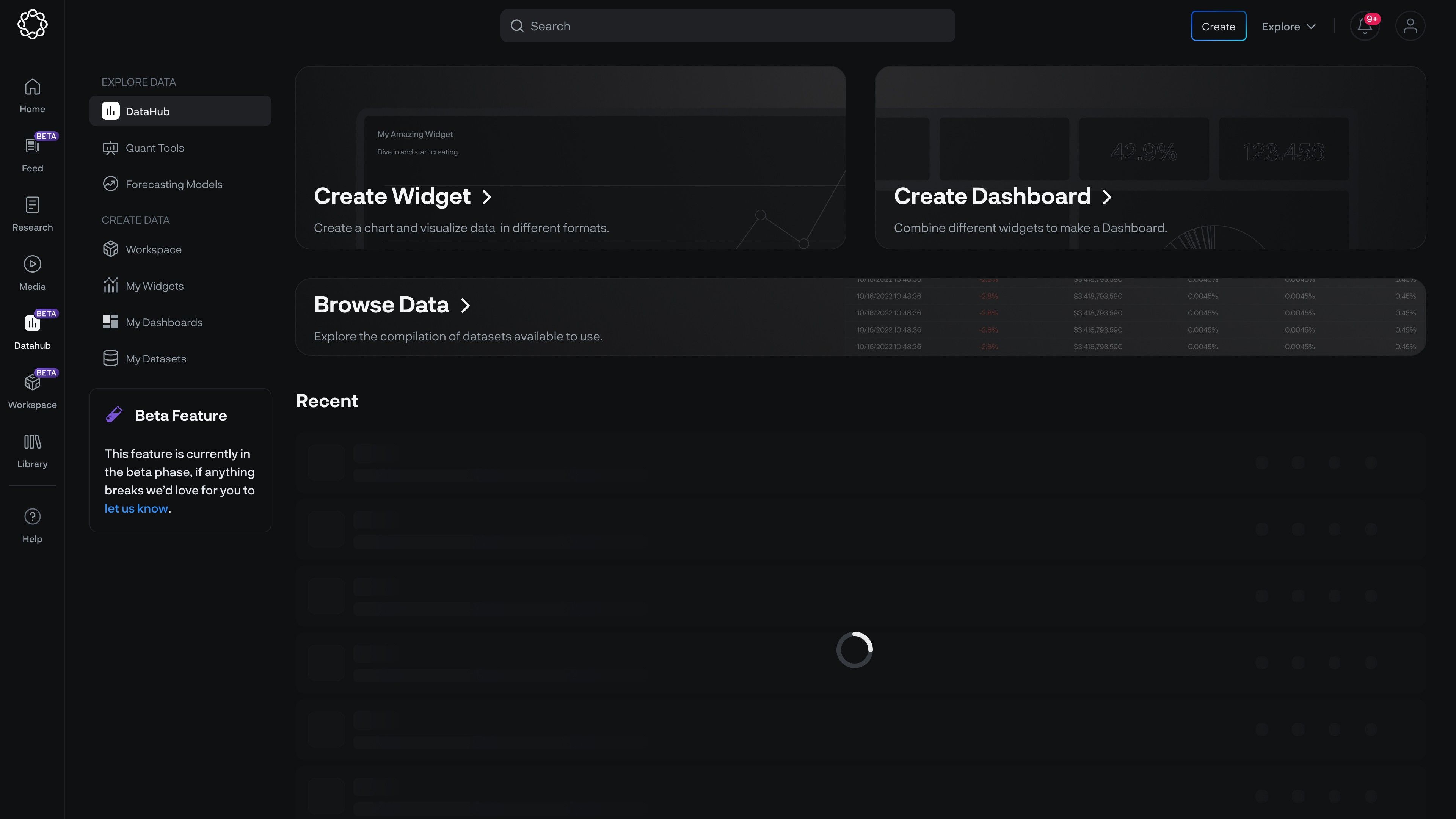
Datahub Home
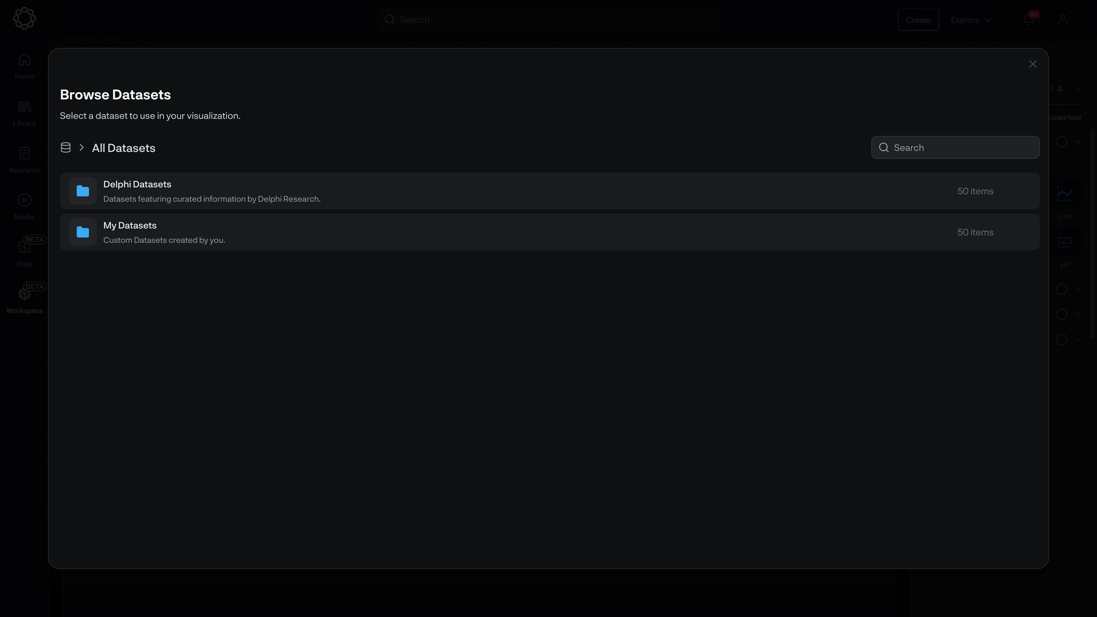
Choose Dataset
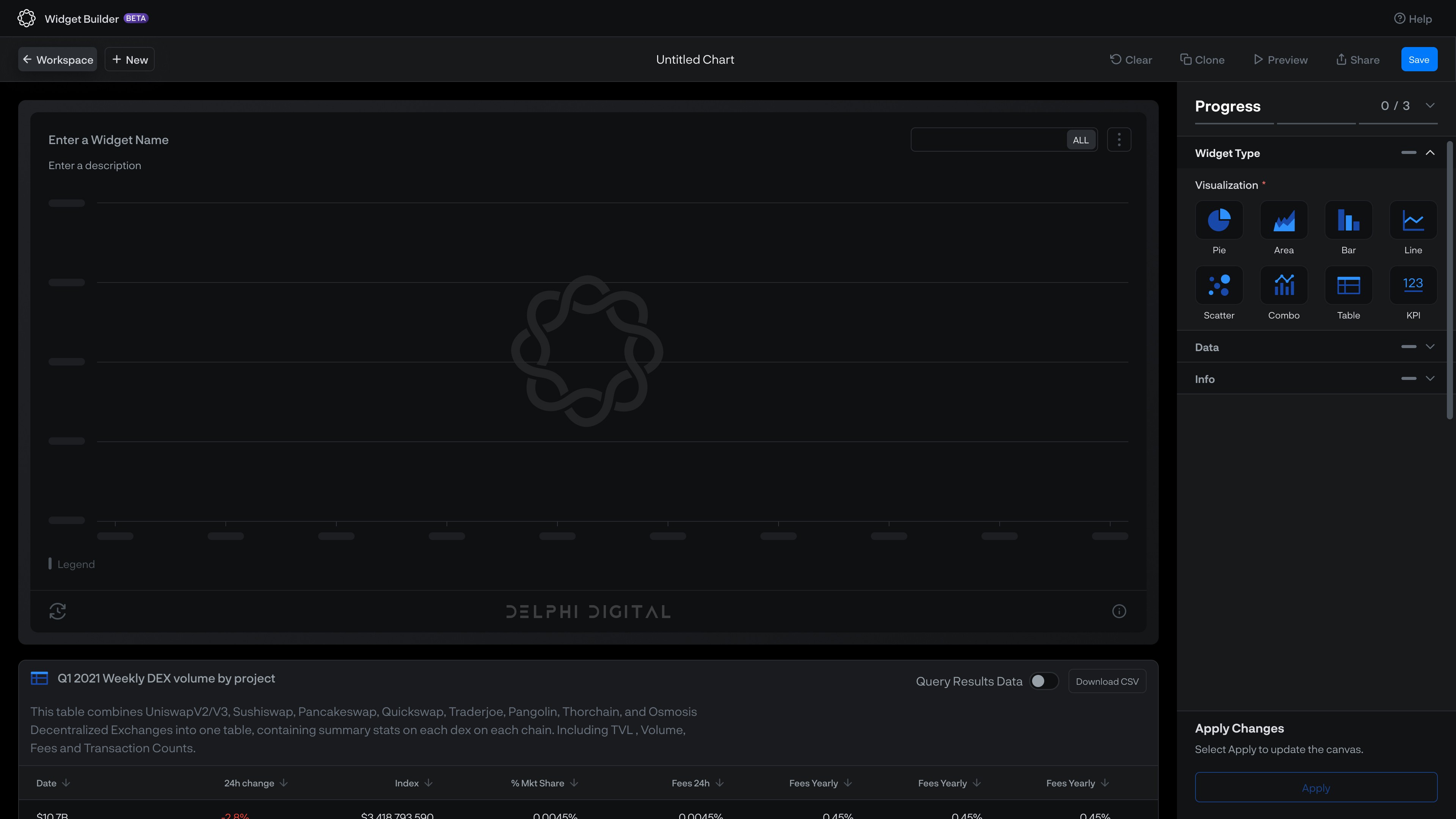
Empty Widget Builder | Select Visualization Type
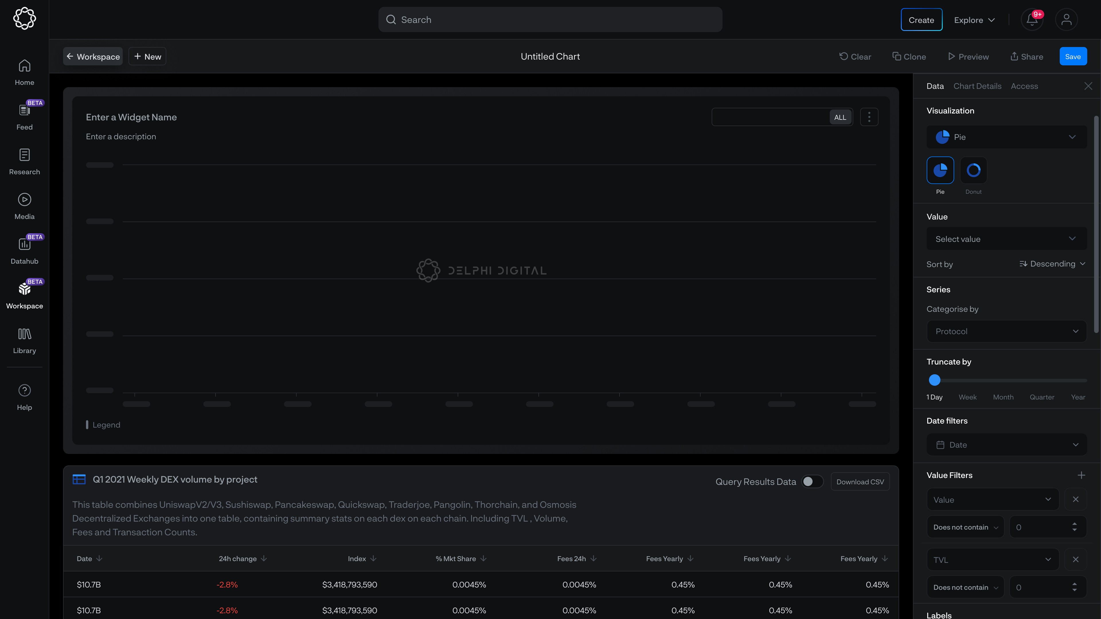
Visualisation Panel
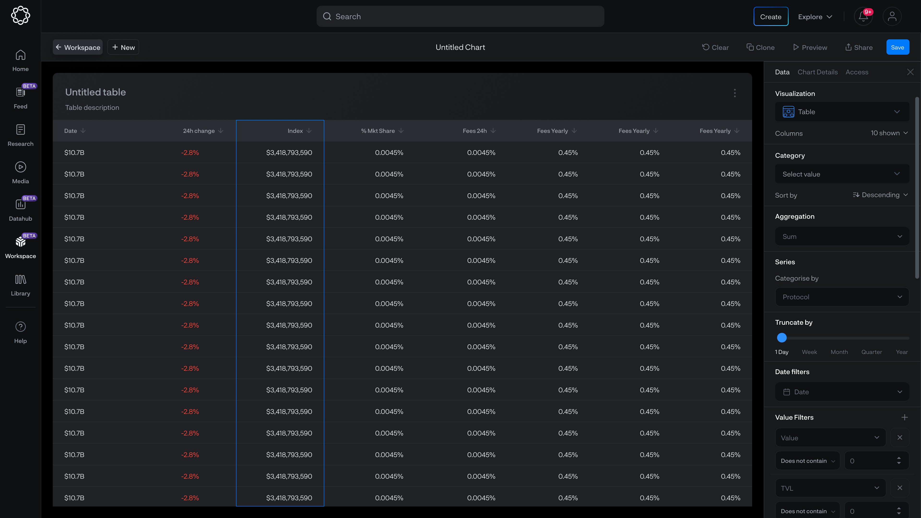
Table Visualization
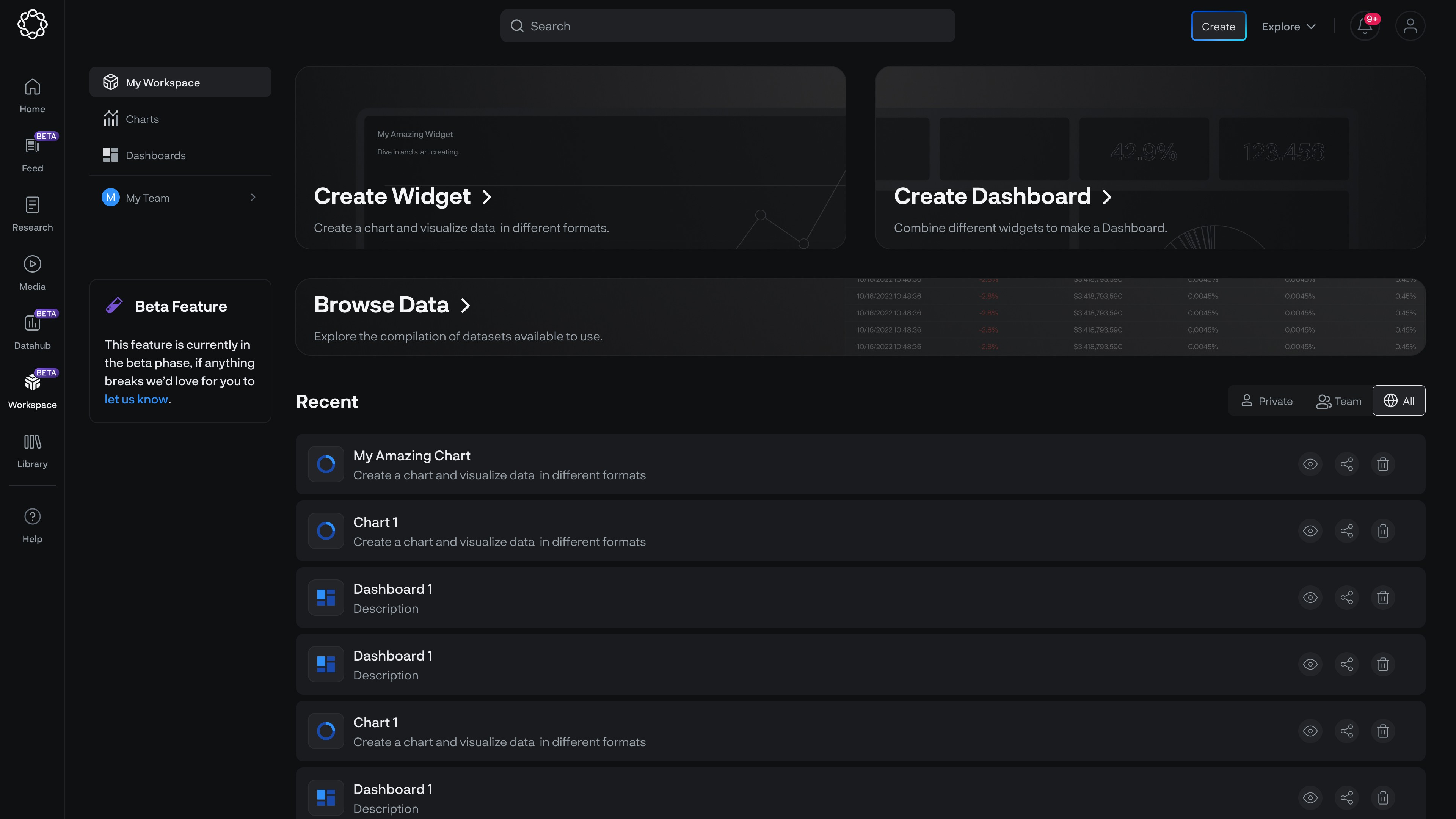
Datahub with Widgets and Dashboards
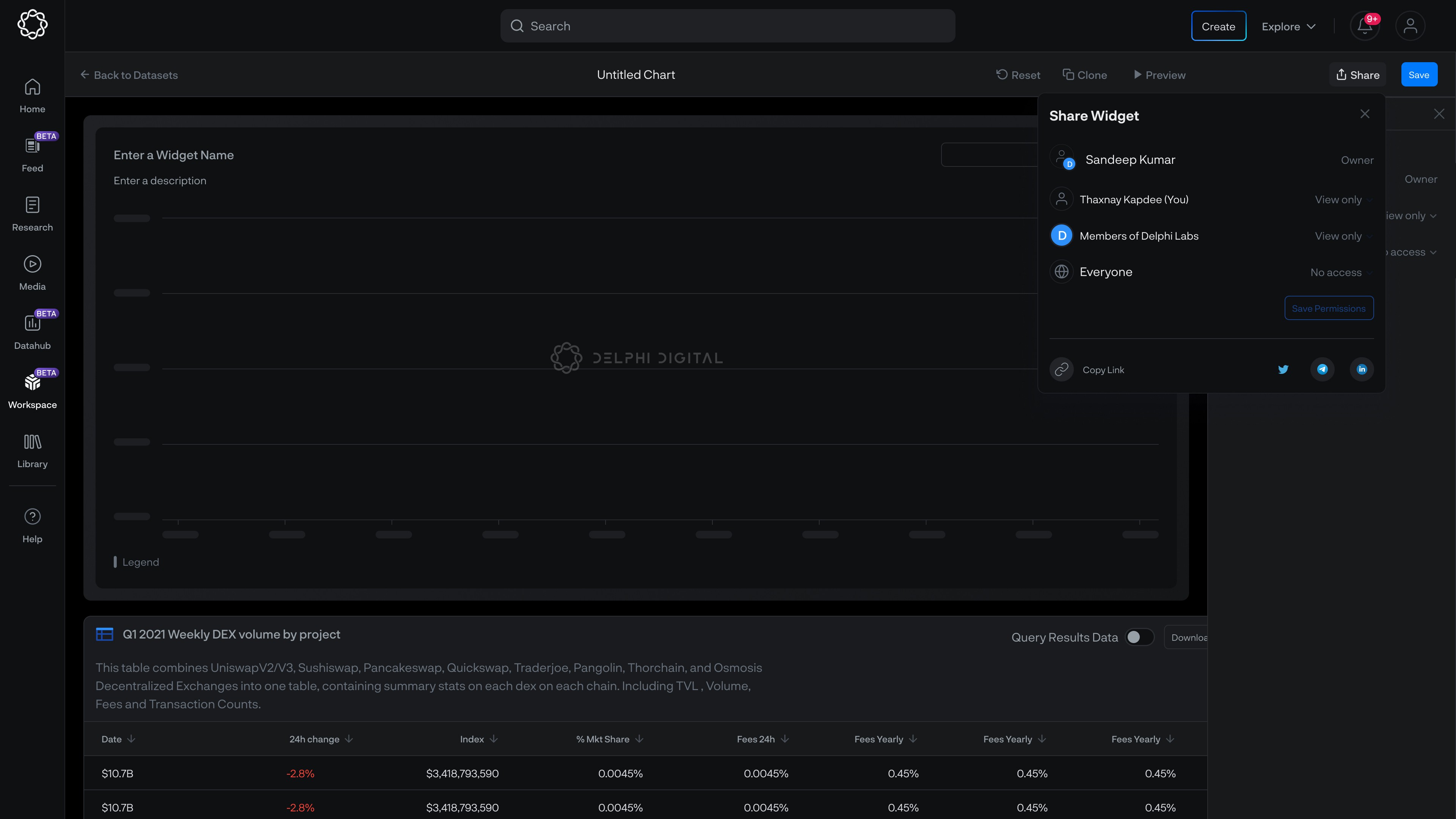
Sharing Options
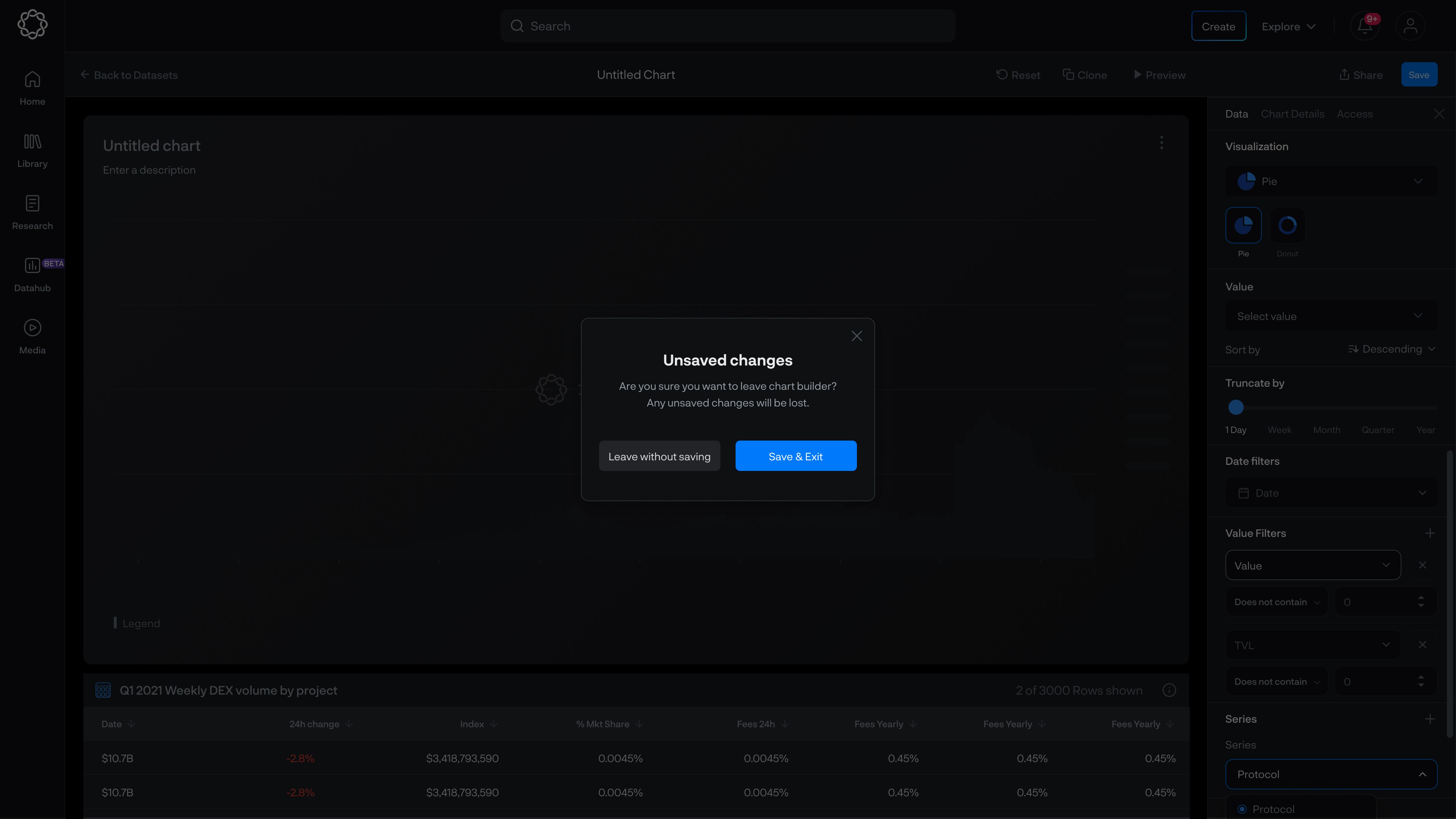
Unsaved changes modal
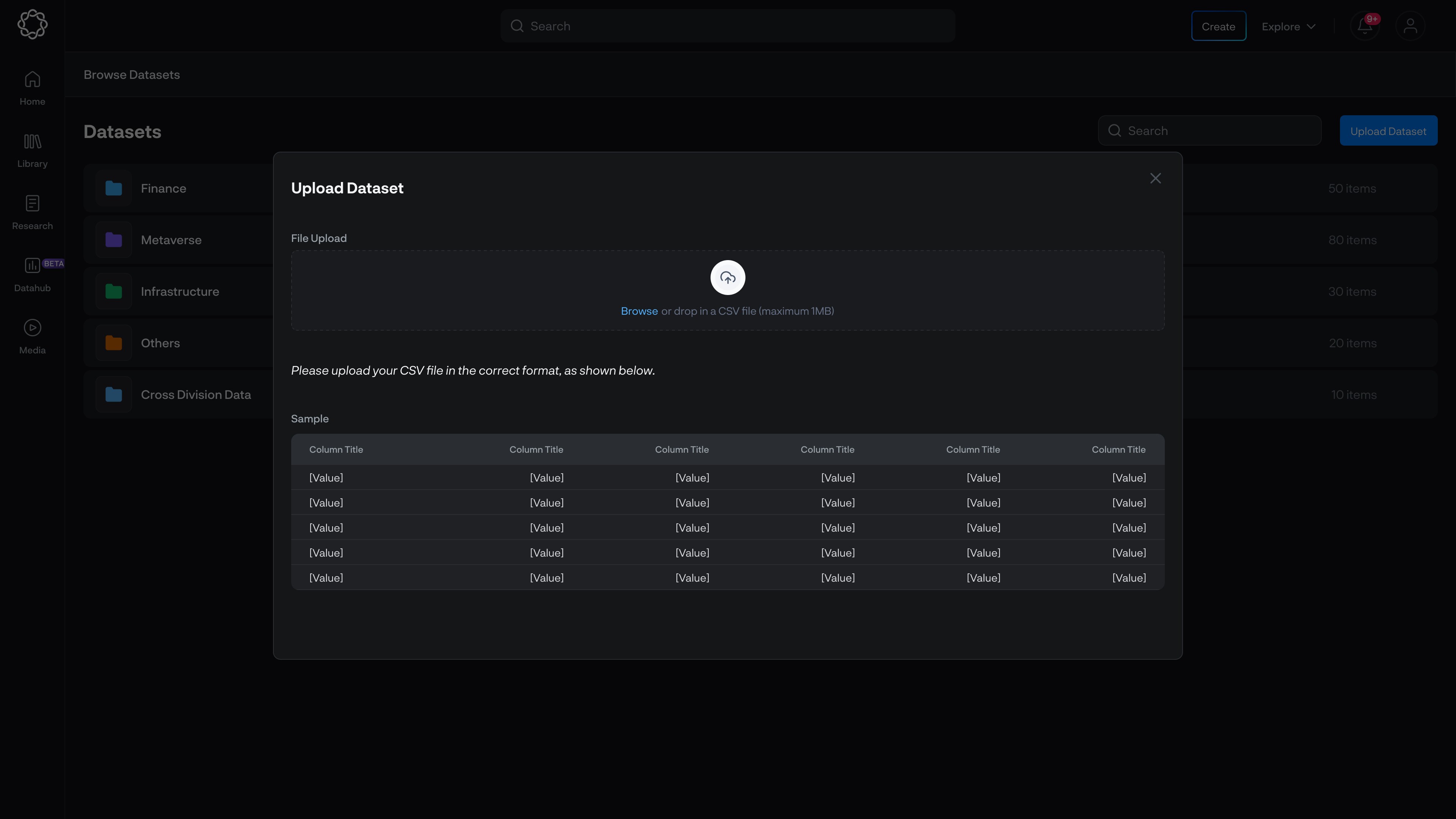
Upload csv Dataset
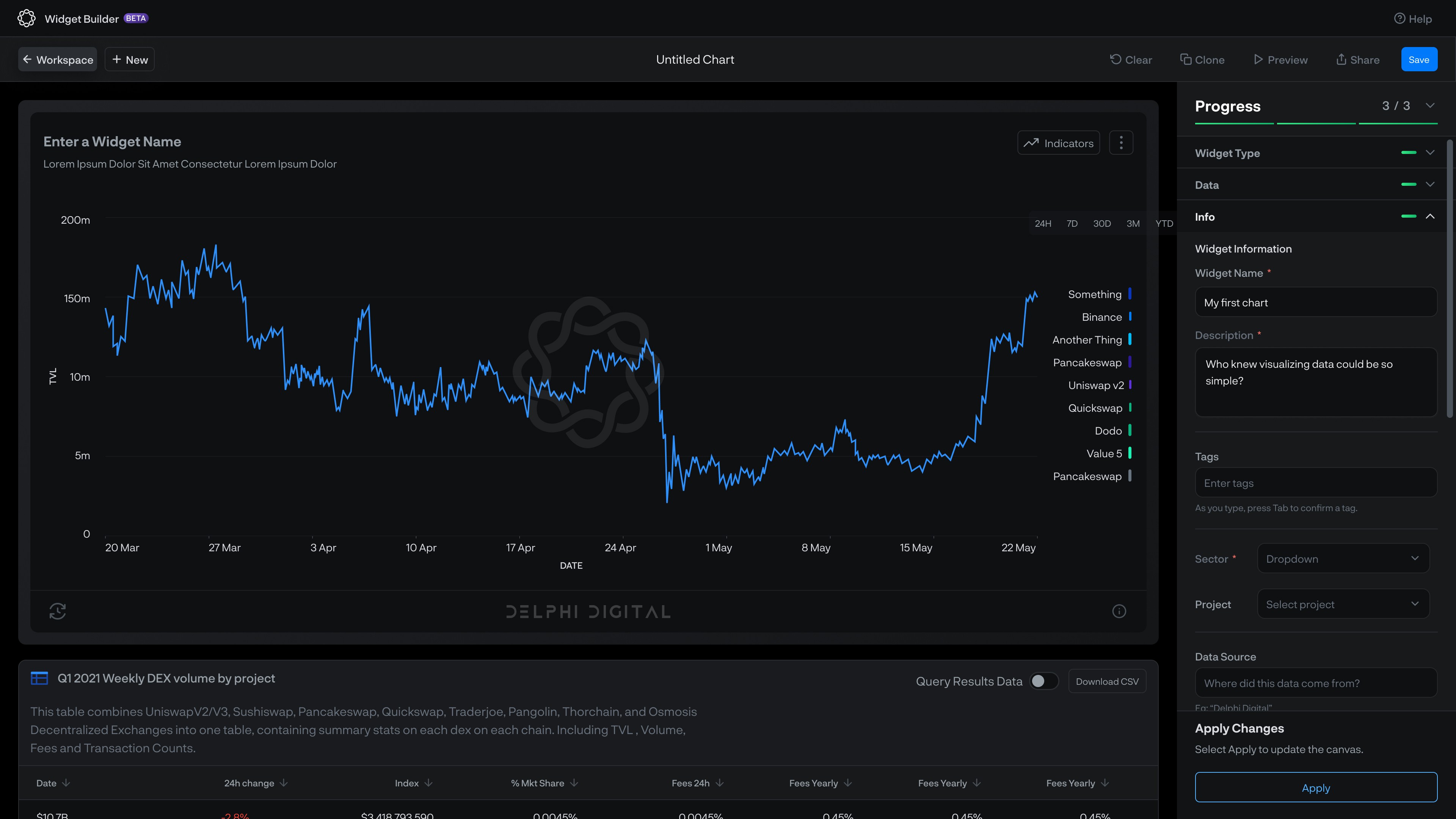
Visualization
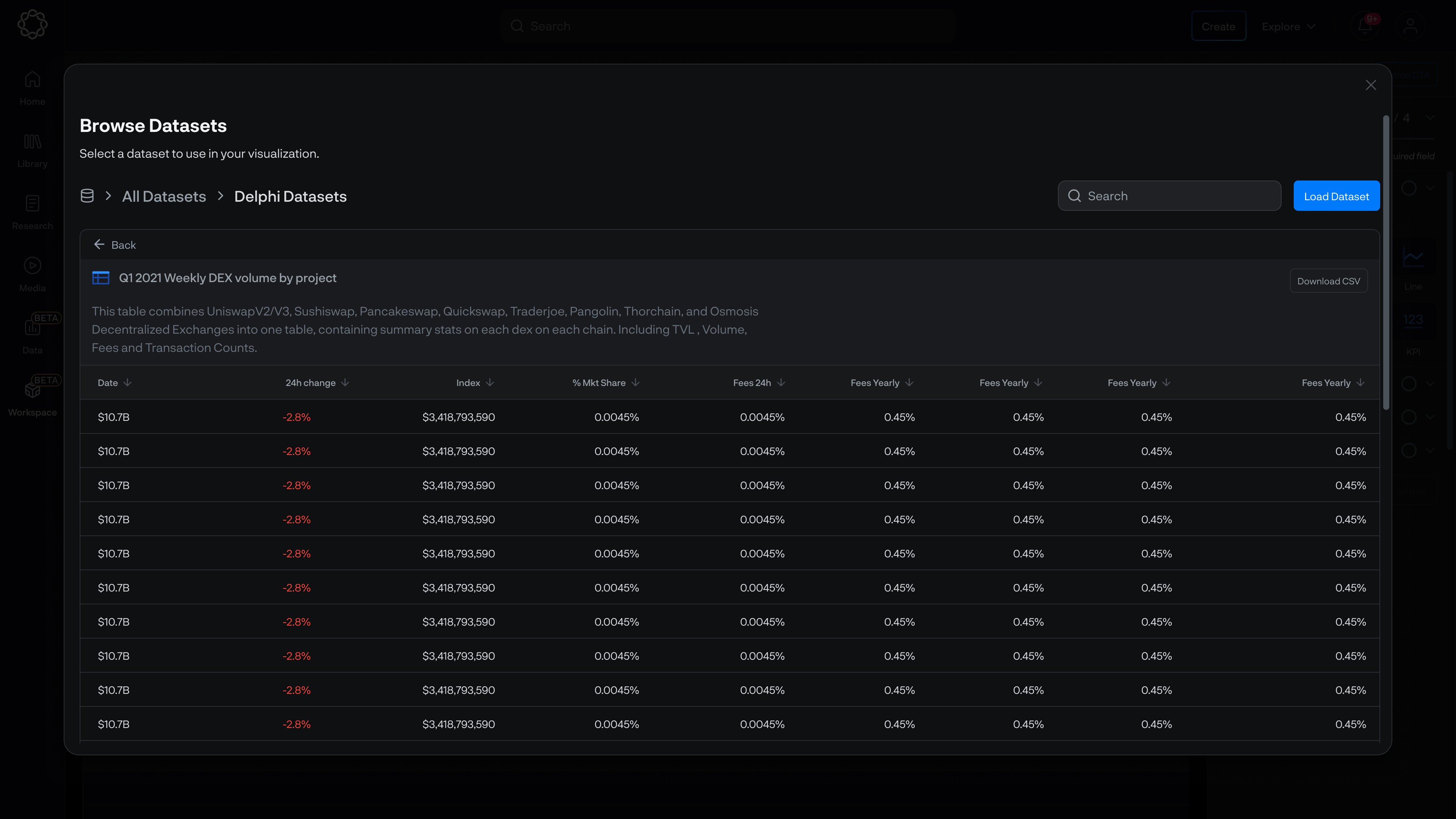
Dataset
02
See also