Design concept
2026
B2B SaaS
A full redesign of a cloud-hosting control panel turning years of feature growth into a product that infrastructure, support, sales, billing teams, and clients could navigate with confidence.
Role
Product Designer
Duration
2-4 weeks
Status
Design concept

A control panel for people who actually run infrastructure
The product belongs to a fully managed hosting provider focused on infrastructure, reliability, performance, and expert support. Its control panel is where customers do the real work: managing services, running deployments, raising support tickets, and controlling access to their environments. It’s where the company’s promise of reliability becomes a real product experience.
They were mid-way through modernising the brand and the wider digital presence. A new marketing site was in development and set the visual direction. The control panel the thing customers actually live in was still wearing the old one.
The problem
Infrastructure engineers, support staff, CRM and sales teams, billing teams, and external clients all shared the same interface. Navigation did not meaningfully adapt to their work, operational actions changed from screen to screen, and backend language leaked directly into user-facing states.
The redesign goal
Reduce cognitive and operational friction without flattening the technical depth expert users rely on. The interface needed to make structure, health, and available actions obvious while keeping detailed infrastructure data accessible.
What I owned
I was accountable end to end: understanding the product, finding the recurring problems, restructuring the system, and translating it into a high-fidelity concept.
01
Research & discovery
Learned the product, the operational model, and the teams using it.
02
Problem analysis
Turned scattered screen-level issues into a small set of root causes.
03
Information architecture
Restructured a 40+ item navigation and a fourteen-tab environment.
04
Design system
Built tokens, typography, status language, and reusable components.
05
High-fidelity design
Designed nine core screens across the product.
Designed in v1.0
Design system and information architecture; environment overview, runtime, and configuration; deployments and pipelines; pods, nodes, and monitors; profile and account security; and support tickets. Billing internals, CRM data models, mobile breakpoints, full dark mode, and engineering implementation were deliberately deferred.
Before designing anything, I catalogued what was wrong
I went through every supplied screen deployment detail, deployment info, tickets, profile and wrote down each specific failure rather than a general impression. Four patterns emerged, and every later decision traces back to one of them.
01
A flat wall of navigation
Dashboard, Infrastructure, CRM, Internal, Support, Sales, Billing each with many sub-items, all expanded into one long list. Everything was reachable and nothing was findable.
02
Density without hierarchy
The screens were dense because the data is dense that part is legitimate. But nothing was ranked. Every row weighed the same, so the eye had nowhere to land first.
03
An action model with no primary
Deployments offered a "Select Action" dropdown, a submit button, and three unlabelled icons (run, delete, edit) side by side. Destructive and routine actions had equal visual weight on a page where the wrong click is expensive.
04
Context the user needed, absent
Tickets didn't show the company, agency or website of the person who raised them. Deployments showed a status but no commit range no answer to "what actually changed?" The data existed; the interface didn't ask for it.
Everyday journeys that stalled
Recover a failed deploy
→
Rollback and retry lived in different controls
Check environment health
→
Required moving across General, Pods, Nodes, and Monitors
Grant IP access
→
Users had to guess between four firewall surfaces
The diagnosis
A visual refresh alone would have produced a cleaner version of the same confusion. The product needed a hierarchy, a consistent action model, and one semantic language for health and state.
Different jobs inside one panel
The product’s own navigation revealed the audience: whole departments, each working from a different corner of the same system.
Infrastructure
Ships deployments and keeps clusters and environments healthy. Needs to read health quickly and recover a failed deployment without hunting.
Support
Runs the ticket queue for client environments. Needs customer, environment, and infrastructure context together.
CRM & Sales
Manages companies, users, permissions, and relationships. Needs account structure without infrastructure noise.
Billing & Clients
Reconciles cost and usage; clients view their own environments. Needs a smaller, safer surface than the internal toolset.
The shared-interface conflict
The same sidebar was presented to infrastructure engineers and client managers alike. Everyone scrolled past everyone else’s tools. The product served the organisation chart rather than the person in front of the screen.
A system before screens
I built the visual and interaction foundation first so consistency would be structural and not dependent on remembering how the last screen looked.
PRINCIPLES
PROBLEM → SOLUTION
Flat hierarchy
→
Rank and group by task, frequency, and viewer
Inconsistent actions
→
One predictable action model across operational screens
Raw system exposure
→
Humane states that explain cause and next step
Fragmented concepts
→
One authoritative model per concept, surfaced in context
No status language
→
A stable semantic vocabulary for health and state
Unmanaged density
→
Summary first, detail on demand
Colour tokens
Surface / Background
#fafaf9 · off-white warm
Accent / Primary CTA
#ea580c · brand orange
Info / Priority state
#2563eb · semantic blue
Success / Verified
#059669 · semantic green
Internal / Staff-only
#7c3aed · internal purple
Text primary
#0a0a0a · near-black
Typography system
Display — Manrope
Control panel
UI & Body — Manrope
Manrope was chosen for its legibility at small sizes and its technical character neither too humanist nor too geometric. Ideal for dense data interfaces.
Data & Code — JetBrains Mono
SHA256:7Hk2…oP3w · #dpl-8821 · 82.69.144.0/24
Labels & Eyebrows
Status · Priority · Assignee · Tags
01.
Health at a glance
The environment page became a composed overview rather than a gateway to fourteen disconnected tabs.
Highlights
A.
Fourteen flat tabs
Overview, Runtime, and Configuration groups
B.
Health assembled across screens
Provider, platform, cluster, monitoring, and last deploy in one strip
C.
Forty-item sidebar
Ranked, collapsible navigation sections
D.
Actions changed by context
Stable Run Actions and Manage Pipelines anchors
02.
Dense data, made scannable
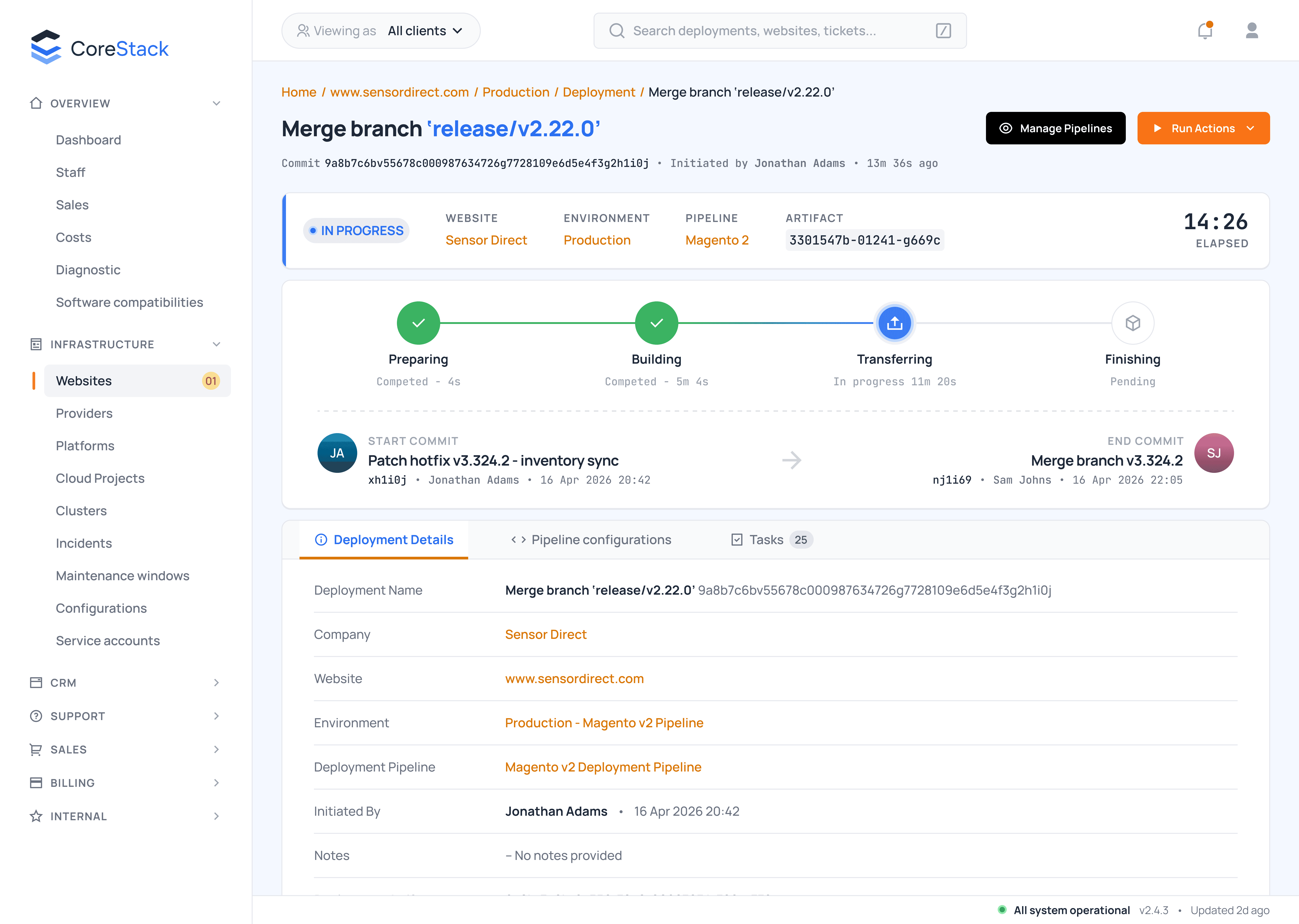
Runtime health, deployments, and pipeline configuration each needed a different presentation, but they now share one hierarchy and status language.

03.
Deployments
Pipeline status, source, mode, and version move into a clear configuration summary. Repository setup becomes progressive, and every deployment row uses one predictable action column instead of a button-plus-dropdown tangle.

04.
Pipelines
The fifteen-column table became a master-detail layout: scan pipelines on the left, inspect full configuration on the right. Boolean cells became labelled settings and toggles, eliminating horizontal scrolling without hiding information.
04
Pipelines

04
Master-detail preserves the full configuration while giving each selected pipeline room to be understood.
05.
Six pages into one coherent account
Profile, 2FA, SSH keys, API tokens, firewall access, and sessions were consolidated into a structure that made security posture visible.

06.
A ticket with context
Reporter, company, website, SLA, and signal sit above the conversation. Internal notes are structurally distinct from customer replies, and the ticket connects directly to the affected deployment and website with live status.

A cohesive concept, traceable from research to screen
v1.0 delivered a shared design foundation, re-ranked information architecture, and nine high-fidelity core screens.
How the model changed
Flat → Ranked
A scoped sidebar and grouped environment hierarchy replace long, undifferentiated lists.
Scattered → Unified
Operational actions and firewall access follow one consistent model.
Raw → Humane
Semantic status and readable states replace backend leakage.
Dense → Progressive
Summaries and master-detail layouts reveal complexity in a deliberate order.
What comes next
This was a concept-stage redesign, so the result is described through delivered scope and product clarity rather than invented performance metrics. The next phase would validate the hierarchy and operational actions with real users, add responsive breakpoints, complete dark mode, and sequence implementation with engineering.
02
See also