Product Design
2024-25
Crypto/Fintech
Turning a fragmented multi-asset OTC platform into a trusted workflow for buy-side traders, while keeping the technical depth they relied on.
What is Offx?
Offx is a private market liquidity platform that helps traders, investors, and market makers discover and create OTC/secondary market deals for crypto assets. Since deal sizes are large and trust matters, the product needed to make information, pricing, and actions feel clear and reliable.
High-stakes transactions
Six- and seven-figure deal sizes mean small UX failures translate directly to lost trades and lost trust.
Private-market workflows
Pricing, availability, and counterparty terms live outside public order books, discovery is the hardest part.
Professional users
Traders, market makers, and liquidity providers who need speed but cannot afford to act on incomplete context.
Highlighted Problem
Users had to work too hard to understand a deal, and in high-value system, that hesitation costs deals.
My Role
I worked on the product experience, UX flows, interface design, and visual system. My focus was on simplifying deal discovery, improving the create deal flow, and making key deal information easier to understand before users took action.
A 01.
UX Research
Mapped the deal lifecycle, identified hesitation points, and rebuilt the create-deal flow around trust moments.
A 02.
Information architecture
Restructured what gets surfaced, when, and how, so traders see what they need at the point of decision.
A 03.
Interface design
Designed every screen in the deal flow with attention to scannability, hierarchy, and high-trust patterns.
A 04.
Visual system
Built a typographic and component system the team can extend to onboarding, new deal types, and future workflows.
The question
How do you make a complex OTC/private market workflow feel trustworthy, clear, and easy to act on?
Approach
Making private-market deal discovery feel clearer and safer
Offx had a strong marketplace idea, but the product experience did not give users enough context, guidance, or confidence to act. Users landed directly into the Deals page with little onboarding, unclear navigation, limited personalization, and not enough decision-making support. For a high-value OTC marketplace where deal sizes could be significant, the flow needed to feel more trustworthy, structured, and informed.
02 A.
The product had no opinion about why you were there
A new user landed on every deal Offx had ever listed. Buyer or seller, $100k or $10M, BTC or some obscure token, same view for everyone. The product didn't know you, so it couldn't help you start.


02 C.
Pricing surfaced too late
Live pricing context wasn't visible at decision points. Traders were forced to compare in their heads. Create offer modal was present on all deal pages, even if someone just want to read thi

02 D.
Create flow lacked guidance
The create-deal flow asked for information without explaining stakes. For a six- or seven-figure transaction, that felt risky.

Users
Professionals moving quickly on large positions.
01
Traders
Care about pricing, availability, and whether the opportunity is worth pursuing right now.
02
Market makers
Need fast, structured deal creation with enough rigor to support serious counterparty conversations.
03
Liquidity providers
Want to surface and match capacity efficiently without rebuilding context every time.
04
Investors
Need trustworthy deal terms, clean pricing context, and confidence before committing capital.
Key UX Challenges
01
Make complex deal data feel simple, without hiding what matters.
Strip the visual noise, but never strip the signal. Traders need every relevant field accessible at a glance.
02
Surface pricing context before, not after, the decision.
A deal only makes sense relative to a reference price. That reference has to live next to the action, always.
03
Keep the create flow fast, while capturing enough for serious transactions.
Speed without rigor breaks trust. Rigor without speed loses deals. The flow has to do both, step by step.
04
Build an interface that feels trustworthy.
High-value workflows demand a confident, restrained interface. Visual restraint is a trust signal.
Turning user requirements into focused product experiences.
The goal was simple but broad: make the product better. I broke that down into user needs, product ideas, flows, and design decisions so each surface solved a clearer part of the workflow.
Design Phases
Phase 1
User requirements
Mapped the core needs behind deal discovery, especially where high-value transactions made small UX gaps feel risky.
Phase 2
Product ideas
Explored ways to make discovery, pricing, and deal context easier to understand without reducing the technical depth
Phase 3
Scope & flows
Turned the strongest ideas into focused flows that could be shipped within the project timeline.
Phase
Design decisions
Defined the final patterns, states, and interactions that made the experience clearer and more trustworthy.
From requirement to design decision.
Each user requirement translates to a specific design move. The mapping is explicit so the team can audit it later.
User requirement
Design decision
Visibility
Dashboard surfaces "what changed since you last looked."
Trust
Onboarding + verification gates rendered as a progress object.
Deal clarity
Inline deal-detail expansion; price & size promoted to the row.
Action confidence
Review/confirm step with explicit deltas before submission.
From sign-up to deal created, in seven steps
The happy path for a first-time user. Each step adds just enough context to help them understand the flow, build trust, and move into the next decision.

Mapping the core user flow
The major UX decisions centered on entry, discovery, and deal creation, making sure user intent carried through the flow and each step had the context needed to move forward.

Build trust during onboarding.
For six- and seven-figure transactions, trust had to show up before the final action. I focused on making each step clearer, more guided, and easier to commit to.
04 A.
Onboarding with context
I made it clear what information was being asked for, why it mattered, and where users were in the process, so verification felt guided instead of abrupt.

01
Tell us about yourself
Captures only what's load-bearing for the next 90 seconds — collects the rest progressively.
02
Personalise your profile
Asset preferences shown as toggles, not multi-select — so the cost of opting in is visible.
03
Welcome aboard
First-run state populated with deals matched against the preferences just set. Zero blank canvas.
04 B.
Make the dashboard action-oriented.
I redesigned the dashboard to do more than display information. It surfaced the most relevant deals, activity, and next steps so users could quickly understand what needed attention and move into action.

01
My activity
Surfaces recent offers, counteroffers, rejections, and deal updates so traders can quickly see what needs attention.
02
Latest deals
Highlights new deal opportunities with the key details traders need to compare them quickly.
03
Create deal
A persistent entry point to start a new deal directly from the dashboard.
04 C.
Surface deal context earlier
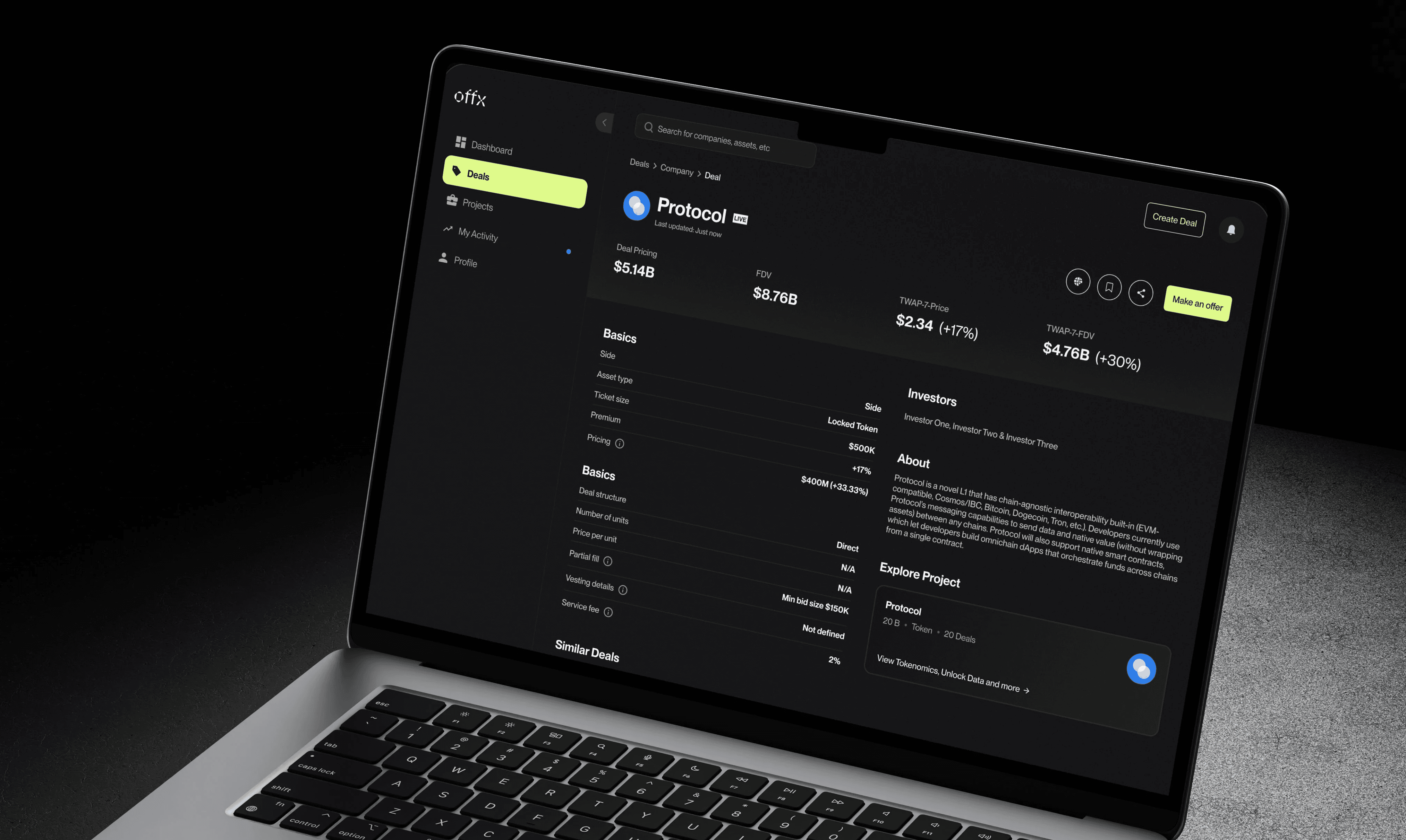
I brought pricing, deal terms, company context, and the primary action into the same view, so traders could understand the opportunity before deciding what to do next.

01
Pricing context
Shows the key valuation and pricing signals upfront, so traders can compare the deal without hunting through the page.
02
Deal terms
Groups the core deal structure, ticket size, premium, vesting, and fees in one scannable area.
03
Counterparty context
Adds company and investor context beside the deal, helping users understand who and what they are evaluating.
04
Make an offer
Keeps the primary action visible once enough context is available, without forcing it too early.
04 D.
Add confidence before submission
I added a review step before deal creation, so users could check the company, deal terms, asset details, and final inputs before committing.

01
Company details
Confirms the selected company before users move deeper into the deal setup.
02
Basic details
Summarizes the core deal inputs, including side, asset type, ticket size, premium, and pricing.
03
Asset details
Keeps the structure, units, fill rules, vesting, and fees visible before submission.
04
Final confirmation
Gives users one last review point before creating a high-value deal.
What changed after the redesign
The redesign didn’t just clean up the interface. It gave traders a clearer way to evaluate deals and gave the team a shared structure for designing, building, and extending the product.
Impact
01
Deal context became easier to act on.
Pricing, terms, and trust signals were brought closer to the decision point, making it easier for traders to scan opportunities and move through the workflow with more confidence.
02
The product had a clearer model to build from.
A shared deal-lifecycle structure helped product, design, and engineering make faster decisions, reuse patterns, and extend new asset flows with less rework.
Learnings
This project reinforced a few things I now look for in every complex product: where trust is formed, how clarity is paced, and what kind of system helps the team move faster without flattening the product.
L.01
Trust needs to be designed into the flow.
In high-value workflows, trust comes from the way each step is structured. The product has to show enough context, timing, and feedback for users to feel confident before they commit.
L.02
Complex products need progressive clarity.
Removing density can make a product feel simpler, but not always more useful. The better move is to reveal information in stages, based on what users need to understand, compare, or decide.
L.03
Scalable design comes from a strong system.
Once the core patterns were defined, the team had fewer repeated decisions to make. Speed came from shared structure, not from redesigning each surface from scratch.
Final Designs


02
See also