Swoop Mobile App

A social app for restaurants to help users meet and order food. ‍

Swoop Mobile App

A social app for restaurants to help users meet and order food. ‍

Swoop Mobile App

A social app for restaurants to help users meet and order food. ‍

Swoop Mobile App

A social app for restaurants to help users meet and order food. ‍

Problem

Since I already got the gist of what the client wanted (given the nature of work i.e. UI Design) and after our brief call, I started to gather more data and did my own research with restpect to the UI and UX. After the initial research I identified that we have a bunch of problems to solve including the UX and I wanted to start from there next. After that the next problem I wanted to solve was, How might we have a better onboarding experience once the user logged in. Like what information do we need for someone to order food? Their Dietary preferences, Zip code (for delivery), and their DOB (maybe send a gift on that) or something like that.‍ After working on the Onborading Experience I moved to other parts of the app, starting from the Dashboard/Home and then to Menus, Nutrition, Feeds and other screens.

Solution

Since I was directly working with a few team members. Initially, I was mostly responsible for redesigning the overall UI but later after the UX audit and thorough research I recommended some UX related changes to the client as well and they were happy to inlcude that in the design. As the project progressed, I had to rethink some wireframes again and again and we went over them with the other team members, and provided a high fidelity version of the app and hence the job encompassed UI Design, Product Design Colors, Typography, and Overall product styling. I also made a few prototypes for them in the after-effects and showed how the app is going to look like in the real world. The idea was to show the client a real functional app rather than just screens.

I got some initial wireframes from the Client but I didn’t find them much useful because a few screens/features were missing so I scheduled a session and tried to understand the product better. I always feel talking to someone and letting them explain what’s in their mind is much useful. After talking to the client, I got to know more about the app and its functions and other features for example, allowing users to order and share food, split their bills, ask staff to come to the table, and gift food to friends or loved ones.

Since I was not involved in the initial product thinking and development, I had to redesign the whole user flow and understand how the app is going to work.‍ I started from the very basic, First I drew and worked on user scenarios, and then I moved to the mockups. Getting some data from competitors and similar apps helped me create the initial wireframes fast and iterate ideas quickly. After some initial validation from the client I moved to next part of the design process.

Year

2021

Timeframe

8 Weeks

Tools

Figma

Category

UI/UX

High fidelity design

High fidelity design

High fidelity design

High fidelity design

Userflow

Userflow

Userflow

Userflow

Wireframe 01

Wireframe 01

Wireframe 01

Wireframe 01

Wireframe 02

Wireframe 02

Wireframe 02

Wireframe 02

Wireframe 03

Wireframe 03

Wireframe 03

Wireframe 03

High Fidelity 01

High Fidelity 01

High Fidelity 01

High Fidelity 01

High Fidelity 02

High Fidelity 02

High Fidelity 02

High Fidelity 02

High Fidelity 03

High Fidelity 03

High Fidelity 03

High Fidelity 03

High Fidelity 04

High Fidelity 04

High Fidelity 04

High Fidelity 04

High Fidelity 05

High Fidelity 05

High Fidelity 05

High Fidelity 05

High Fidelity 06
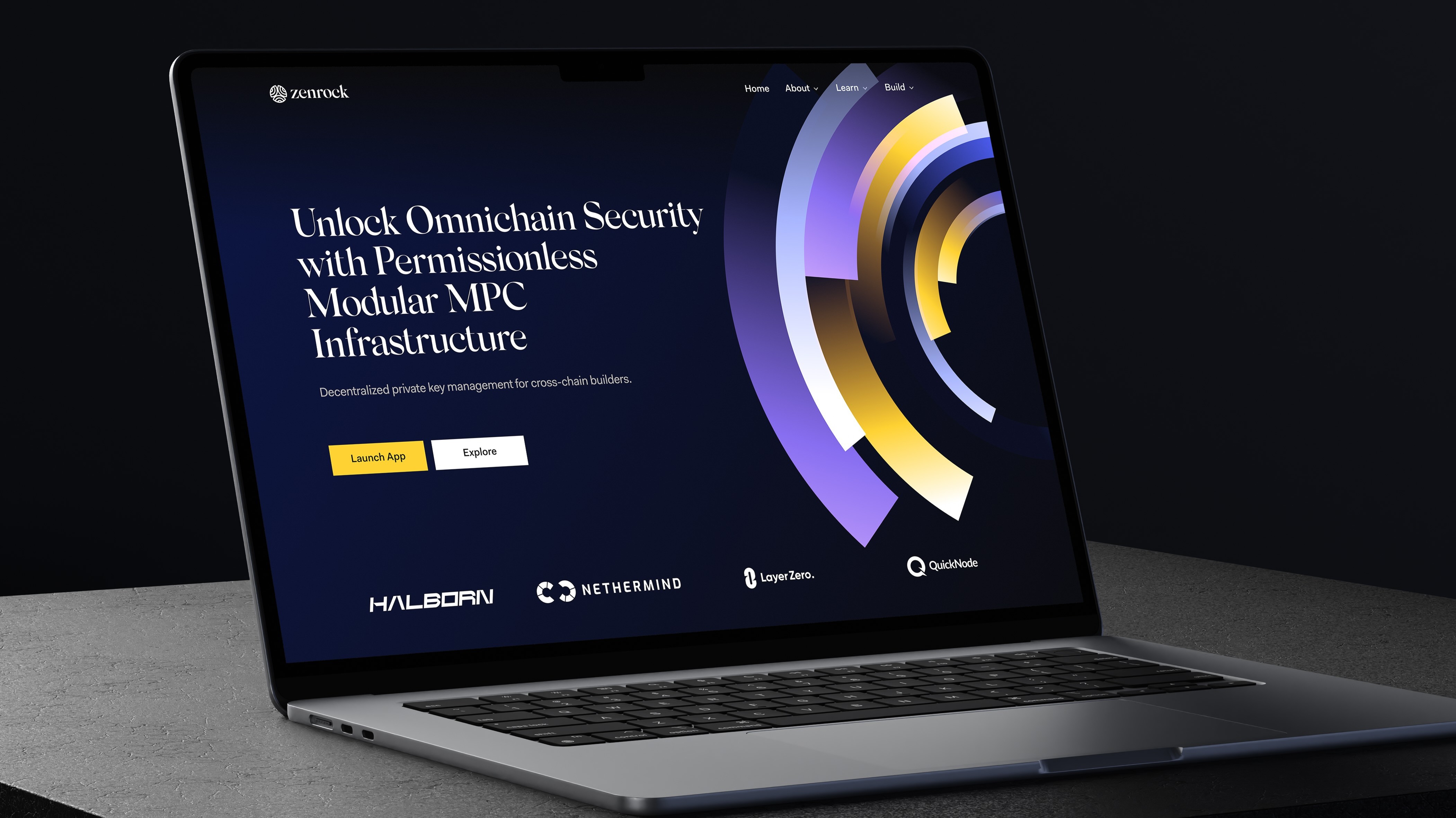
High Fidelity 06

High Fidelity 06

High Fidelity 06

Say hello

I'm open for freelance projects, feel free to email me to see how can we collaborate

Say hello

I'm open for freelance projects, feel free to email me to see how can we collaborate

Say hello

I'm open for freelance projects, feel free to email me to see how can we collaborate

Say hello

I'm open for freelance projects, feel free to email me to see how can we collaborate